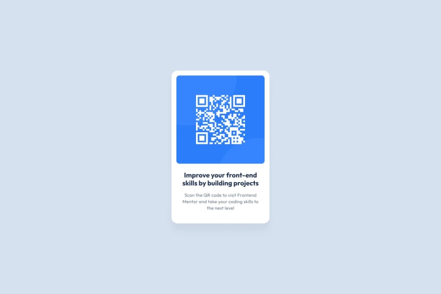
Design comparison
Community feedback
- @rohit246-ambitiousPosted 5 months ago
1.The solution uses semantic HTML effectively for about 80% of the content. There is room for improvement in the remaining 20% to enhance clarity and accessibility. 2.As mentioned, there is a 20% area that can be improved. Specifically, adjusting the card heights to prevent inner content from being congested would enhance the user experience. 3.The layout looks good across a range of screen sizes, ensuring a consistent and visually appealing user experience 4.The CSS could be more organized and easier to understand. Some parts are a bit confusing and would benefit from refactoring for better readability and reusability. 5.The solution matches the design closely, with about 80% accuracy. There are some discrepancies, but overall it maintains the intended look and feel.
Marked as helpful0@Mixipixi91Posted 4 months ago@rohit246-ambitious Thank you for your input, I appreciate it a lot and have been working on the points mentioned and have updated my code, which is now published in Github.
Feel free to check it out as I would love your feedback :)
0
Please log in to post a comment
Log in with GitHubJoin our Discord community
Join thousands of Frontend Mentor community members taking the challenges, sharing resources, helping each other, and chatting about all things front-end!
Join our Discord
