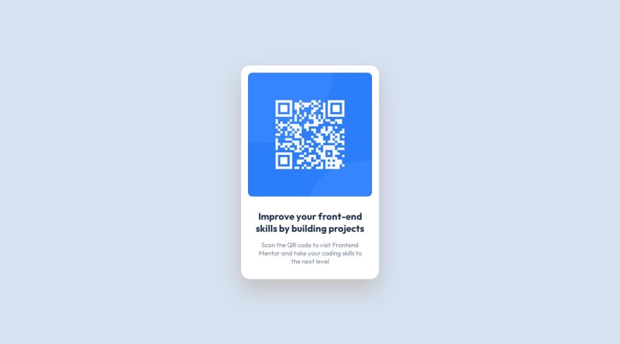
Design comparison
Solution retrospective
I am most proud of getting the design down using my CSS skills. I was able to pull this together fairly quickly and when I got stuck I knew where to look for troubleshooting. Next time, I would consider reading more about where to view different design elements in Figma. I learned this on the fly and if I read some documentation it may have been a quicker process.
What challenges did you encounter, and how did you overcome them?The main challenges I encountered were learning how to use Figma for a design specs. I have used Photoshop in the past and only have used Figma to review designs and prototypes. Therefore I had to learn on the fly where to find the design specs I was looking for for each element. The second challenge I had was the drop shadow of the card. On the design file it has a faint drop-shadow with some opacity applied to it. But using CSS I could not figure out how to apply opacity to a drop-shadow. So I had to customize the shading of the color using a HEX palette so that it was as similar to the design as possible.
What specific areas of your project would you like help with?Alternative ways to apply drop-shadow and opacity.
Community feedback
Please log in to post a comment
Log in with GitHubJoin our Discord community
Join thousands of Frontend Mentor community members taking the challenges, sharing resources, helping each other, and chatting about all things front-end!
Join our Discord
