Design comparison
SolutionDesign
Community feedback
- @cmachdevPosted about 2 years ago
Nice work...
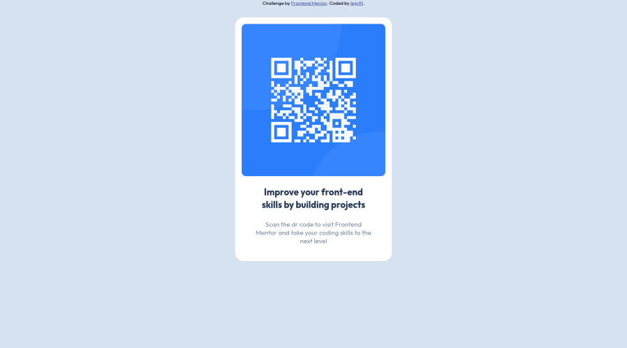
to center the .card horizontal and vertical you can use flexbox in the body, using - min-height: 100vh; display: flex; flex-direction: flex-direction: column; justify-content: center; align-items: center;
and you don't need to add position: absolute; top: 40%; left: 50%; transform: translate(-50%, -50%);
0
Please log in to post a comment
Log in with GitHubJoin our Discord community
Join thousands of Frontend Mentor community members taking the challenges, sharing resources, helping each other, and chatting about all things front-end!
Join our Discord
