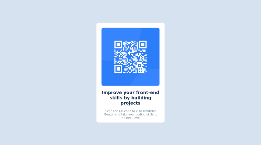
Design comparison
Community feedback
- @Aliyu-SaiduPosted almost 2 years ago
Nice work Munzer Mardini and congratulations for the successful completion of this challenge. Please find below tips to help you improve your code.
-Every website must have at least one landmark (like main, nav, footer). In this case, you may want to replace the div container with 'main'.
- To give proper space between your design and screen on mobile view, you may consider giving your body element a padding say 2rem. You could otherwise give margin to of say 2rem to the div container (which you could replace with 'main' container).
- You may consider using flex or grid to easily handle any layout on your website. It's easier and much more convenient. You can can read through that in w3schools.com.
- You may visit the accessibility report links provided for you above to learn more about accessibility.
Please feel free to contact me if you need more help.
If you find this feedback helpful, you may consider hitting the helpful button below.
Happy coding!
Marked as helpful1@munzerxPosted almost 2 years ago@Aliyu-Saidu Thank you so much I'm a software engineer and I wanted to improve on my basics of HTML and CSS.
Thank you for these amazing and helpful tips, you are truly amazing.
0@Aliyu-SaiduPosted almost 2 years ago@munzerx you are most welcome.
I am very glad I could help in my little way.
We are all here to improve on our front-end coding skills. By the way, I am also an Engineer, a Chemical Engineer though. But I aspire to be a software developer expert. Any tips or resources would highly be appreciated!
Happy Coding Mate!
1
Please log in to post a comment
Log in with GitHubJoin our Discord community
Join thousands of Frontend Mentor community members taking the challenges, sharing resources, helping each other, and chatting about all things front-end!
Join our Discord
