Design comparison
Solution retrospective
All feedbacks are welcome
Community feedback
- @Dev-TronPosted almost 3 years ago
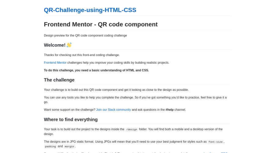
Hmm, let's see here. It looks like your files are a bit all over the place in your repository. The first thing Id says you should do is organize your CSS and image files in their own folder. Make sure you reference that CSS stylesheet in your link located in the header of your Html. Second, edit your readme-template.md and rename it readme.md. Make sure you delete the current readme.md displayed right now. Lastly, you should probably rename your qr.html to index.html and delete the one you don't need anymore. You should also read and try fix your accessibility and html issues as those are required skillsets to have. You could place your content between tags such as <header> <body> <footer> to fix the landmarks issue. After these steps try pushing to your github and seeing if this improves your solution.
0
Please log in to post a comment
Log in with GitHubJoin our Discord community
Join thousands of Frontend Mentor community members taking the challenges, sharing resources, helping each other, and chatting about all things front-end!
Join our Discord
