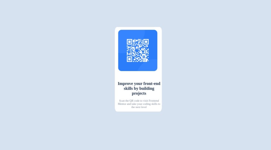
Design comparison
Solution retrospective
All feedback is welcome
Community feedback
- @faisalahmed11Posted over 1 year ago
Hi there @waad2lf, here are some suggestions from my side.
- centring items.
#container {
min-height: 100vh; // forcing container to take a minimum of the screen's height.
display: flex;
justify-content: center; // centring on the main axis, in this case horizontally.
place-items: center; // centring on the cross axis, in this case vertically.}
Marked as helpful1 - @Thewatcher13Posted over 1 year ago
-
you should have always a main landmark element included in your html
-
NEVER skip the headings order in html, there should be first an h1 before you using an h2
-
Why are you don't use an alt on the image? It's really important!
-
use a css reset, look on Andy's Bell website for a good and clear one
-
never set a height on a container, the content provides the height
-
never use px for font-size but rem https://fedmentor.dev/posts/font-size-px/
-
your font-family should be inculde in the html, like the design says
-
dont use ID in css, bcs is has a high specificity, use classes
Marked as helpful0 -
- @fernandolapazPosted over 1 year ago
Hi 👋, perhaps some of this may interest you:
HTML / ACCESSIBILITY:
- The main content of every page (the card in this case) should be wrapped with the
<main>tag.
- Every page should have an
<h1>to improve user experience and because it is an important element when it comes to SEO. It is good not to skip heading levels.
- This is a meaningful image and in case the user can't see it, it should have an
alttext with a description.
CSS:
- You might consider using some CSS reset as a good practice at the start of each project, to have a clean starting point and reduce differences between browsers.
For example, here are some very common and useful ones to get you started:
* { box-sizing: border-box; margin: 0; padding: 0; }- If you want to center the content you should add
align-items: centerandmin-height: 100vhto the 'container', and remove the margin-top from de 'item'.
- You don't need to use
font-weightof 400 and 700 as these are the default values for normal and bold fonts (paragraphs and headings).
I hope you find it useful, any questions do not hesitate 🙂
Regards,
Marked as helpful0@waad2lfPosted over 1 year agoBut,what is the min-height used for?@fernandolapaz
1@fernandolapazPosted over 1 year ago@waad2lf
By default, the height of the body is limited to cover the content of the page.
If we want to center the content we must make it occupy the entire viewport (100vh).
And it is better to use
min-heightinstead ofheightto prevent the page to be cut off in viewports with small height (such as mobile landscape orientation).0@waad2lfPosted over 1 year agoso, the min-height should be at the body? @fernandolapaz
0@fernandolapazPosted over 1 year ago@waad2lf
Oh sorry, I didn't notice in my previous answer that you had done it in the container.
It is best to center the content using Grid or Flexbox in the body:
body{
min-height: 100vh;
display: flex;
justify-content: center;
align-items: center;
}
Marked as helpful0 - The main content of every page (the card in this case) should be wrapped with the
- @Thewatcher13Posted over 1 year ago
Be sure you applied the feedback on your projects asap!
0@Thewatcher13Posted over 1 year agoWhat? I mean we give feedback, so we spend time and effort to analyze your code..? If you can comment on everyone his solution, you have time to applied that feedback we give and learn, so that you will be able in the future for giving valuable feedback too! I will help you, but if I see you don't update your code with the feedback, why should we give feedback?
0
Please log in to post a comment
Log in with GitHubJoin our Discord community
Join thousands of Frontend Mentor community members taking the challenges, sharing resources, helping each other, and chatting about all things front-end!
Join our Discord
