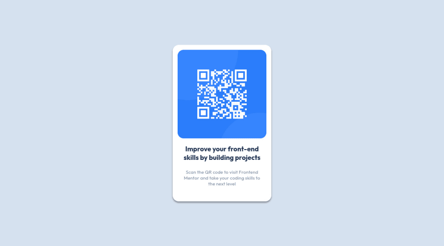
Design comparison
Solution retrospective
All feedback is welcome.
Community feedback
- @Deepanshu-5288Posted over 2 years ago
Hello David, It's looking great just a little suggestion.
Since you are using flex you can easily center your card using flex properties rather than using margin. You can refer to the below link: https://www.w3schools.com/css/css3_flexbox_container.asp
Make sure adding min-height : 100vh as it will make your div have height of the 100% of the view height so that when you use align-content:center it will be in center of 100vh otherwise height will be adjusted to the max height of the content inside div which will not be in the center of screen.
I hope its help you.
Thanks, Deepanshu
Marked as helpful1 - @correlucasPosted over 2 years ago
👾Hello David, congratulations on your first solution!👋 Welcome to the Frontend Mentor Coding Community!
Nice code and nice solution! You did a good job here putting everything together. I’ve some suggestions for you:
1.Use
<main>instead of a simple<div>this way you improve the semantics and accessibility showing which is the main block of content on this page. Remember that every page should have a<main>block and that<div>doesn't have any semantic meaning.2.Use relative units like
rem or eminstead ofpxto have a better performance when your page content resizes on different screens and devices.REMandEMdoes not just apply to font size, but all sizes as well. To save your time you can code your whole page usingpxand then in the end use a VsCode plugin calledpx to remto do the automatic conversion or use this website https://pixelsconverter.com/px-to-rem3.Reduce the CSS you can use the direct selector for each element instead of using
classthis way you have a code even cleaner, for example, you can select everything using the direct selector for (img, h1, and p, main).✌️ I hope this helps you and happy coding!
Marked as helpful1 - @vanzasetiaPosted over 2 years ago
Hi, David! 👋
Congratulations on completing your first Frontend Mentor challenge! 🎉
I recommend removing Bootstrap. It is overkilled to use a CSS framework to finish a small challenge. Also, it will slow you down in mastering CSS. So, I suggest writing all the styling without using any CSS framework.
More suggestions:
- Remove the
topandleftproperties from themain-boxandimgelements. Those properties are not working with the static position. For your information, by default, all elements areposition: static. - Also, remove the
top,right,leftproperties from theh1. It's not needed. - There's no need to set
widthandheightto any elements. I am guessing that you were copy-pasting the CSS code from Figma (or Sketch). Those code snippets aren't supposed to be used. You need to think about whether or not the code snippet is appropriate. - I notice that the site is importing unnecessary font weights (
wght@100;200;300;400;500;600;700;800;900). Only import the necessary font weights. - I suggest making the
imgas a block element and settingmax-width: 100%to make it easier to work withimgelement. - The card only needs a
max-widthto prevent it from filling the entire page. No need forwidthandheight.
Hope this helps! 🙂
Marked as helpful0 - Remove the
Please log in to post a comment
Log in with GitHubJoin our Discord community
Join thousands of Frontend Mentor community members taking the challenges, sharing resources, helping each other, and chatting about all things front-end!
Join our Discord
