Design comparison
Community feedback
- @RyanDillon94Posted 7 months ago
Hello!
Just looking through your code and it seems like you have a lot of copy and paste for your
@mediaqueries. If your styles are going to be the same for all screen sizes then you don't need them in two separate media queries, you can just have them in your main CSS file as a base style and use the@mediaquery for styles that are going to change when you scale up/down.It also looks like your trying to center your content by using
top: 50%and margins which hasn't worked if that's what you were going for... Next time try usingdisplay: flex;justify-content: center;andalign-items: center;on the parent div.I'm just a bit of a newbie myself so I hope that all makes sense!
Marked as helpful0@mishticklePosted 7 months ago@RyanDillon94
Thanks so much for the feedback. It's been a while since I've done HTML / CSS so I was bound to make some errors, and your feedback is very useful to help me improve. The reason I used media queries was because I originally used a different method to center the web content on the page, and didn't update the CSS to remove the media queries once it was no longer necessary. I will go back and utilise your feedback to improve my solution, and it has helped me refresh my memory somewhat as well. It's been a long time since I've used flex or grid, so I'm gonna check out the CSS tricks webpage for a refresher.
1 - @AkoToSiJeromeEhPosted 7 months ago
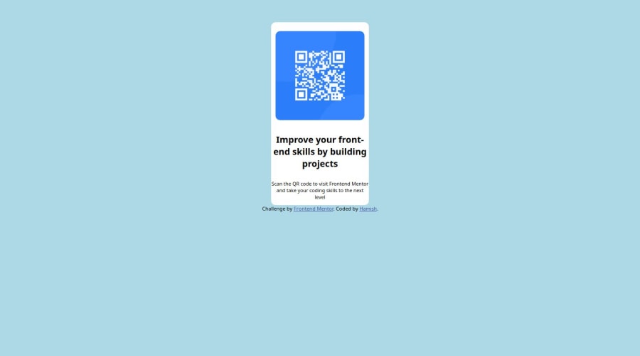
Hi there! Great work out there! I noticed that the QR Card component is not vertically aligned, and I recommend adding CSS properties to the body or specific element , such as d-flex and its related properties. Additionally, it's important to include min-height or height for proper alignment. By adding this to the body properties, you can achieve centering of the QR Card component. . I hope this suggestion helps and works for you. Happy coding!
  body {
    background-color: lightblue;
    min-height: 100dvh;// you can add height for proper alignment
    display: flex; // add this
    align-items: center ;  // add this
    justify-content: center;  // add this
    flex-direction: column;  // add this
  }
.container { display: flex; flex-direction: column; width: 220px; background-color: white; border-radius: 10px; margin: auto; // you can remove this margin-top: auto; // you can remove this margin-top: 50px; // you can remove this position: relative; // you can remove this top: 50%; // you can remove this gap: 5px; // you can add this gap between contents and its part of flex attr padding: 8px; // you can add also padding to have a space inside your container or card }1
Please log in to post a comment
Log in with GitHubJoin our Discord community
Join thousands of Frontend Mentor community members taking the challenges, sharing resources, helping each other, and chatting about all things front-end!
Join our Discord
