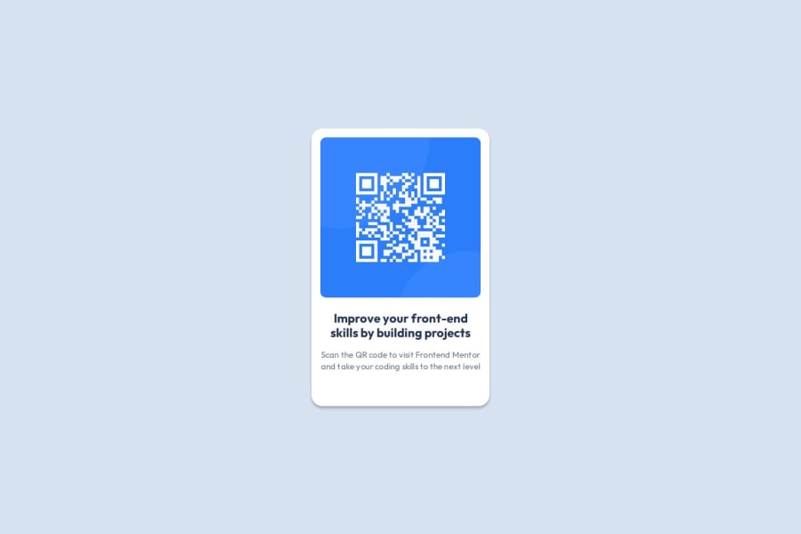
Design comparison
Solution retrospective
I think I made good use of BEM naming conventions for this simple little challenge. It's not necessary for this challenge but maybe I wouldn't create a .card__container class, but instead a more reusable container type class.
N/A
What specific areas of your project would you like help with?No particular areas but open to any feedback regardless
Community feedback
- @stezorPosted 4 months ago
I think your solution looks great. Maybe react is overkill in this case although I understand if u wanted to practice it. Also I made body into a grid and then centered content, not to say your solution is worse with one extra element, I just like to have as few elements on the page as possible. I think h1 tag is too high semantically for card component, although I couldn't tell which one to use cause I'd like to learn that myself haha. I simply used p tags and styled 'em with css, which I think isn't great either. I think you did great job, but I had to write something cause I think we all learn best when exposed to as many ideas and perspectives as possible.
0
Please log in to post a comment
Log in with GitHubJoin our Discord community
Join thousands of Frontend Mentor community members taking the challenges, sharing resources, helping each other, and chatting about all things front-end!
Join our Discord
