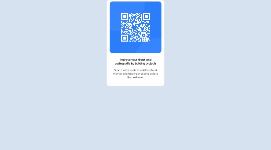


Design comparison

Solution retrospective
I found it difficult to position the QR_code exactly at the center of the page, although i watched many YouTube videos. Waiting for your corrections, all feedback welcomed!!
Community feedback
- @d8701aPosted over 1 year ago
Hi, congrats on finishing this challenge!
I took a gander at your code and here are a couple of things that perhaps I would've done differently:
-
Avoid setting many properties on body. Somehow I prefer to keep it clean, I might set font-family on my body but not much more. Some people put display: flex or display: grid on body element (I saw you put grid), but generally I think it will be easier for you as a beginner to treat body element as the whole working space and not limit its size or height.
-
Instead, I would use another element within the body and wrap my content inside. For example, you can call it <main> or make it simply a div wrapper and put your content inside. Now here is where you can set your viewport height: 100vh, display: flex or grid properties, limit its width etc.
-
There are many ways to center elements vertically or horizontally but I think the simplest solution is display: flex. Now you might want to keep in mind that display: flex must be set on a parent container, not the children inside of it, in order to make it work. Then you can use justify-content: center and align-items: center properties to perfectly center it.
Let me show you what I mean:
<body> <main> <div class="box"> <img>Your image goes here</img> <h2>Heading</h2> <p>Paragraph</p> </div> </main> </body>In CSS, that would look like this: main { display: flex, justify-content: center; align-items: center, min-height: 100vh; width: 100%; }
.box { display: flex; flex-direction: column; justify-items: center; align-items: center; width: 290px; }
- Last but not the least, I saw you used grid on the body element. While some people do this for responsive layouts, I prefer to avoid it, like I said, it's much cleaner if you create another section within the body and set the properties to it instead of the body. Your grid property will not do much unless you define the columns too. So something like: display: grid; grid-template-columns: 1fr 1fr; could give you two columns etc.
My advice is to spend some more time on flexbox and grid. Once you get it, it will make many things so much easier for you, for example centering and aligning items, responsiveness etc. Don't rush it, flexbox is a weird thing, it likes to mess around sometimes and I don't know if anyone really understands it 100% but you will be able to do so much more with the basics.
I think you are onto something good, though. The idea to use grid to create a card is not a bad idea at all, I've seen some very experienced developers do it. Just don't forget to define columns with grid.
Here is a video of a really amazing developer whose channel I've been following for a while and his content is nothing short of extraordinary. He explains flexbox and I hope it will be useful to you as well: https://www.youtube.com/watch?v=u044iM9xsWU
Other than that, just keep learning and don't get discouraged, it's a process and it takes time but in the end does get rewarding! :)
Marked as helpful0@04lesliePosted over 1 year agoThanks a lot for the advice, just that I'm really new to css.. thanks for the link! ^_^
0 -
- @andiedoescodePosted over 1 year ago
Hi, congrats on completing the challenge!
I see that you're trying to use the grid layout and you're heading in the right direction.
For your body, you don't need the place-item or padding properties. Instead, add a height property of 100vh. Then in your container, you'll just need to use a place-self property with value of center. This should center your component in the middle of the screen. See below for what I mean.
body {
background-color: hsl(212, 45%, 89%);
font-family: "Outfit", sans-serif;
display: grid;
min-height: 100vh;
margin: 0;
}

.container {
text-align: center;
background-color: hsl(0, 0%, 100%);
border-radius: 15px;
width: 300px;
place-self: center;
If you'd like another option, using Flexbox would be an alternative to easily center a div.
To minimize the amount of repetition, you don't need font-family it in the container class as it's already been declared in the body. Import the Google Font carefully - looking at the head of your HTML, the only Outfit font weight you've linked is 200. The design specifications are for 400 and 700. Once that's fixed in the header, the font-weight properties you've applied to the text in your CSS will show up.
For more pixel-perfect matching, you can play around with the font sizes and the spacing from the top of the QR code image to the edge of the white.
Hope this helps!
Marked as helpful0


Please log in to post a comment
Log in with GitHub
Join our Discord community
Join thousands of Frontend Mentor community members taking the challenges, sharing resources, helping each other, and chatting about all things front-end!
Join our Discord