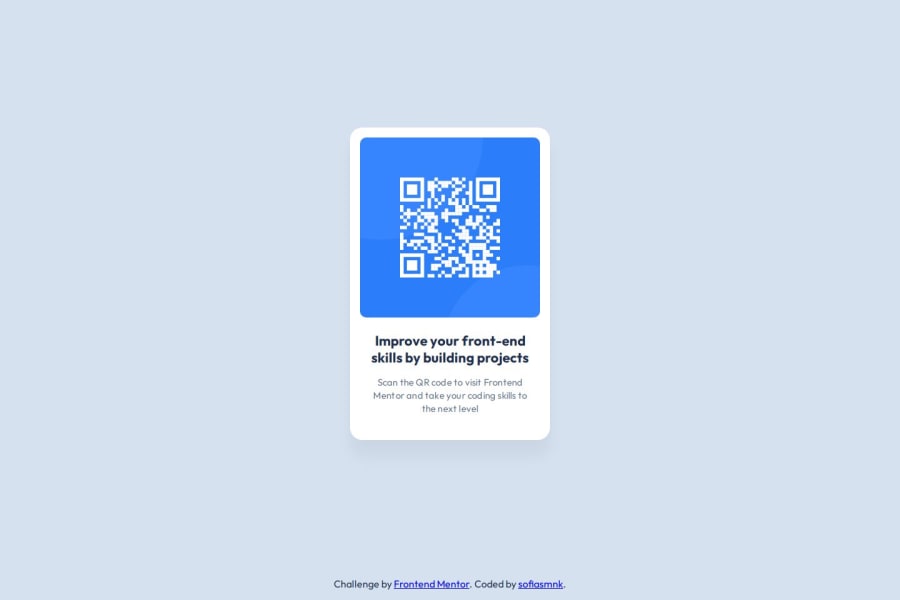
QR Code challenge using custom properties, grid and flexbox
Design comparison
Solution retrospective
The biggest challenge was getting more used to using git. I was happy to find out how easy it is to create a new Github repo from a local one using the gh repo create
command from the Github CLI. But, I was also testing out the GitButler git client/GUI and it was a bit confusing, I'm not sure I'll use it next time.
There were some decisions about how to write the CSS that were difficult to make with the challenge being just one component in isolation without the rest of a website around it as context. I tried to imagine there was a whole website that I wasn't seeing, but I'm not sure I succeeded at that.
What specific areas of your project would you like help with?Is it semantic to use a element for the card, or would it be better off as a generic
?
Community feedback
- @huyphan2210Posted about 1 month ago
Hi, @sofiasmnk
I checked out your solution, and I have some thoughts:
- Regarding your Git issue, there are many Git GUI tools available that you can explore to find the one that suits you best. Personally, I use GitHub Desktop. However, if possible, I recommend sticking with the Git command line interface (CLI). Using the CLI can deepen your understanding of Git’s functionality, as it provides more control over commands and operations. Additionally, it can be more efficient for performing complex tasks and troubleshooting issues, making it a valuable skill in the long run.
- Technically, the
<html>
element represents the entire web page, which includes both the content visible within the viewport (the area of the browser window where the page is displayed) and the content outside the viewport that can only be seen by scrolling. While some parts of the HTML, like thebody
, will always have sections in the viewport, not all of it is visible at once (for example, thehead
, which contains metadata and is not displayed on the page). - I came across a course on HTML & CSS where the instructor explained that HTML elements are like boxes that can be nested inside one another. This analogy is helpful for visualizing the structure of web elements, as each element acts as a container for content or other elements. This concept is foundational in both HTML and CSS. Given this understanding, it’s completely normal to find it challenging to make CSS decisions when working on a single component in isolation. However, CSS can actually guide you in this process. I recommend researching CSS further to improve your decision-making skills.
- It's generally better to choose a semantic element when possible. This enhances accessibility and helps search engines understand the content better. Use generic elements only if the card is more of a visual component without significant meaning on its own.
Hope this helps!
0 - @AlfredKonnehPosted about 1 month ago
As for me, I used article to represent self contain peace of content. instead of me using div, I prefer using article element. I'm also learning and new to web development.
0
Please log in to post a comment
Log in with GitHubJoin our Discord community
Join thousands of Frontend Mentor community members taking the challenges, sharing resources, helping each other, and chatting about all things front-end!
Join our Discord