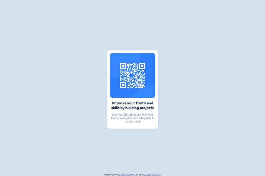
Design comparison
SolutionDesign
Solution retrospective
What are you most proud of, and what would you do differently next time?
I'm proud of how the code turned out, this helped me practice writing CSS by trying to get as close to the solution as possible.
What challenges did you encounter, and how did you overcome them?These are the following challenges I encountered during this project:
- Center div using CSS, what helped me: How TO - Center Elements Vertically by w3schools.
- Box shadow using CSS: CSS Box Shadow by w3schools.
- Position a div at the bottom of the document for the attribution: How can I position my div at the bottom of its container? on stackoverflow.
I would like to know how to better approach aligning elements using CSS.
Community feedback
Please log in to post a comment
Log in with GitHubJoin our Discord community
Join thousands of Frontend Mentor community members taking the challenges, sharing resources, helping each other, and chatting about all things front-end!
Join our Discord
