QR Code challenge solution HTML and CSS only
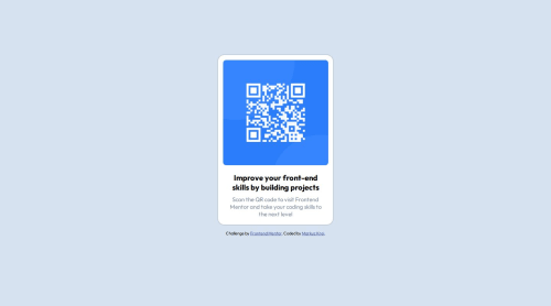
Design comparison
Solution retrospective
I am most proud that I was able to nearly copy the same design provided by Frontend Mentor though I had to use a lot of complicated and maybe unnecessary codes to attain it. I would make sure to study more to learn how to minimize my code.
What challenges did you encounter, and how did you overcome them?I had difficulty when my container's height keeps extending when the view is adjusted or scrolled down. I searched through the internet in order to find out what was wrong, I only read and read but nothing until I tried to experiment on it myself. Thanks to the answers from stack overflow which says its most likely the height property, I was able to accomplish it. From height: 51vh; to height: 100%;.
What specific areas of your project would you like help with?I would like help with the spacings and how to place good values in the margins, paddings, widths and heights. If possible, I would also like to learn how I could minimize my code by using only the necessary properties. I also want to understand how the min-width and max-width works in the media queries.
Community feedback
- @Jolijn0101Posted 5 months ago
Hi Jerico Jones B. Edic, Congratulations with finishing this project. You did a great job in coping the design. It has still some differences but that is difficult to copy if you have only the screenshot files.
Maybe the Pixel Perfect Pro extension for the Crome browser could make it a little more easy. In case you use Crome it can create an overlay of the screenshot design so you could easier copy the design with your code. You can find more info about that on this page: https://chromewebstore.google.com/detail/pixel-perfect-pro/nnhifpoojdlddpnhjbhiagddgckpmpfb?pli=1
You could use the min-width in cases were you need a minimum width and the element will grow further. The max-width is useful to set a maximum to the width of an element.
.container { width: 100%; min-width: 100px; max-width: 300px; }
In this example the .container will at least be 100px and not smaller. The .container will grow until it reaches the 300px. This could be written in one line using clamp:
.container { width: clamp(100px, 100%, 300px); }
I hope my feedback is useful ;)
Marked as helpful1@0653JericoPosted 5 months ago@Jolijn0101 wow many thanks and will surely be using that extension. :D
0 - @cristianccggPosted 5 months ago
hI @0653Jerico. Good job, looks great. Regarding your comments about minimizing CSS, you can try using some CSS frameworks like Bootstrap or Tailwind. I have used both but in my recent projects I used Tailwind mainly because it renders the CSS classes and removes the ones you are not using which makes the code more solid and less heavy. Give it a try and that will help you a lot and save you some time, mainly on the responsive things. It could be hard at the beginning but once you understand it, it's very useful. There are lots of YouTube tutorials to begin with.
Marked as helpful0@0653JericoPosted 5 months ago@cristianccgg Ohhh these frameworks are those classes that you add to the HTML right? Yeah, I was planning to try and learn it too once I get to learn a bit more of CSS then I'll definitely move to bootstrap or tailwind. Many thanks to you sir! :D
0 - @Iridelis40Posted 5 months ago
Good job!
1
Please log in to post a comment
Log in with GitHubJoin our Discord community
Join thousands of Frontend Mentor community members taking the challenges, sharing resources, helping each other, and chatting about all things front-end!
Join our Discord