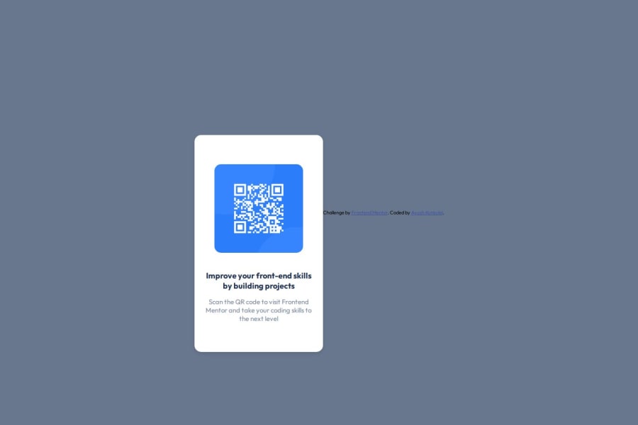
Design comparison
Community feedback
- @Mahmoud-Abdelkarim777Posted 3 months ago
- hi bro i saw your coding it is good but needs improve.
- remove #container { width: 100; /* height: 350px; */ } and You forgot px in width
- add to body {flex-direction: column; gap: 1rem;}
- You will see the difference after these improvements.
- wishing the best for you
Marked as helpful0 - @bhuvi819381Posted 3 months ago
Hello Brother,
I checked your solution, and it’s looking good! Here are a few suggestions to refine it further:
-
📄 Upload your README file
Make sure to use the provided README template and upload it to improve project clarity and presentation. -
🔠 Use a single
<h1>
Every page should have one<h1>to ensure proper document structure. -
🚫 Avoid using
px
Replacepxwith relative units likeremoremfor better responsiveness and scalability. -
✂️ Reduce the padding on your box
Too much padding can affect the overall layout—consider minimizing it. -
🔄 Set
flex-direction: columnin the<body>
Applyingflex-direction: columnwill help align your content vertically in a more organized manner.
These adjustments will enhance your project’s quality and maintainability. Keep up the great work! 👏
Marked as helpful0 -
- @Tremy-tPosted 3 months ago
Overall, it’s a solid project. Keep up the great work, and I look forward to seeing your next update!
Marked as helpful0
Please log in to post a comment
Log in with GitHubJoin our Discord community
Join thousands of Frontend Mentor community members taking the challenges, sharing resources, helping each other, and chatting about all things front-end!
Join our Discord
