Design comparison
SolutionDesign
Community feedback
- @EONRaiderPosted over 2 years ago
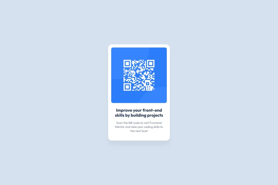
Hello there. I think your solution is almost perfect from a visual standpoint, but I’d make changes to the following issues:
- The “Scsn the QR code…” text seems to be a lighter shade of gray than it should. Check the design guidelines and you’ll find the right one.
- The top padding of the QR code itself seems to be short just a few pixels when compared to the model.
I hope this helps.
0
Please log in to post a comment
Log in with GitHubJoin our Discord community
Join thousands of Frontend Mentor community members taking the challenges, sharing resources, helping each other, and chatting about all things front-end!
Join our Discord
