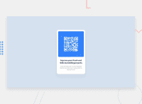
Design comparison
SolutionDesign
Solution retrospective
Do you want to recommend any best practice for me
Community feedback
- @Deevyn9Posted about 2 years ago
Hi Kelvin, congrats on submitting your solution, here are somethings i noticed that you’ll need to add to your solution
(i) you’ll need to center the container using display: flex; justify-content: center; align-items: center;.
(ii) you’ll need to use the right background color.
(iii) you’ll need to add extra margin or paddings to your container to give it a bit more space.
Happy coding 🎈
Marked as helpful1@Kellycypher98Posted about 2 years ago@Deevyn9 thanks for the feedback. I'll do the corrections and reupload. i've followed you on twitter as kellyboateng pleas give me a follow back
1
Please log in to post a comment
Log in with GitHubJoin our Discord community
Join thousands of Frontend Mentor community members taking the challenges, sharing resources, helping each other, and chatting about all things front-end!
Join our Discord

