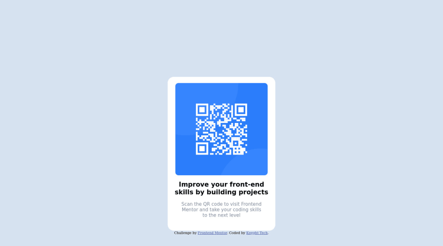
Design comparison
Solution retrospective
Why does my text look different than what is exampled? What could I have done to make this a cleaner code?
Community feedback
- @RMK-creativePosted almost 3 years ago
Hi Jacob, congrats on completing your first challenge!!! 🎉🎉. The first of many I hope ;)
You've done a really great job, I just have a few tips for you:
-
First to answer your question about the text: you have applied the class="bold" to the <section> tag which wraps around your <h1>. If you apply that class directly to the h1 and delete your <section> tags you will see the text will change (and you can then edit to get it closer to the design if you wish to). Wrapping the <h1> like this is not really necessary for this challenge, same with the <main> tag that wraps the <p> - I would also remove <main> and apply class="text" directly on the <p> tag.
-
Read up on html semantics a little to get a good understanding of best practices (for example: https://www.semrush.com/blog/semantic-html5-guide/)
-
Try using indentation to make your code a little easier to read, for example:
<html>
  <body>
    <h1>Hello World</h1>
    <p>Example text</p>
    <div>
        <img />
    </div>
  </body>
</html>
Keep going, you're off to an excellent start!
1 -
Please log in to post a comment
Log in with GitHubJoin our Discord community
Join thousands of Frontend Mentor community members taking the challenges, sharing resources, helping each other, and chatting about all things front-end!
Join our Discord
