Solution retrospective
I most proud of that I am able to do the first challenge.
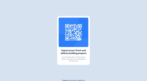
What challenges did you encounter, and how did you overcome them?The most challenging that I encounter on this challenge was to center the QR design. I overcome this by searching on how I can make that kind of design I have tried the margin auto and change to position:absolute, I get the exact design using on web but when I tried it on the mobile I don't it was not on the center, lucky I saw a post about using the transform: translate that is how I am able to get the exact design.
What specific areas of your project would you like help with?I would like to know if ever there is another way to center it, I use this codes to achieve my design
position:absolute; top:50%; left:50%; transform:translate(-50%, -50%);
Please log in to post a comment
Log in with GitHubCommunity feedback
No feedback yet. Be the first to give feedback on fhelix09's solution.
Join our Discord community
Join thousands of Frontend Mentor community members taking the challenges, sharing resources, helping each other, and chatting about all things front-end!
Join our Discord