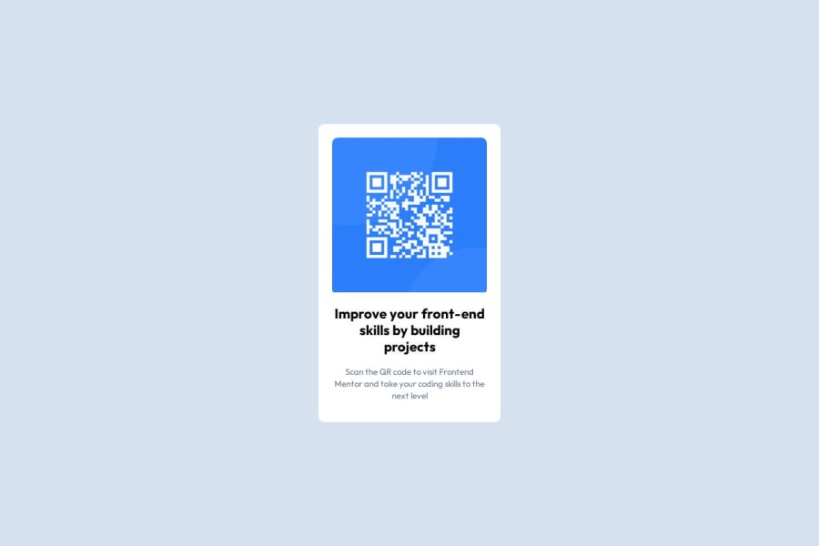
Design comparison
Community feedback
- P@Islandstone89Posted 5 months ago
Hello, good job on this challenge!
Here are some suggestions for an even better solution - I hope they help :)
HTML:
- The alt text must also say where it leads(the frontendmentor website). A good alt text would be "QR code leading to the Frontend Mentor website."
CSS:
-
Including a CSS Reset at the top is good practice.
-
Since Outfit is a sans-serif font ,change
font-family: "Outfit", serif;tofont-family: "Outfit", sans-serif; -
I recommend adding a bit of
padding, for example16px, on thebody, to ensure the card doesn't touch the edges on small screens. -
I would move the styles on
.maintobody. -
Remove the margin on the card, as it is already centered using Flexbox.
-
Remove
widthandmin-widthon the card. Instead, give it amax-widthof20rem, so it doesn't get too wide on larger screens. -
On the image, add
display: blockand changewidthtomax-width: 100%- the max-width prevents it from overflowing its container. Without this, an image would overflow if its intrinsic size is wider than the container.max-width: 100%makes the image shrink to fit inside its container.
Marked as helpful1 - @Toye-devPosted 5 months ago
Hello @calixmnt,
Great job completing the challenge. The solution is significantly close to the design.
However, I'll like to suggest that the
border-radius: 10px;increased to aboutborder-radius:14pxcould make the solution even look better.Happy coding!
1
Please log in to post a comment
Log in with GitHubJoin our Discord community
Join thousands of Frontend Mentor community members taking the challenges, sharing resources, helping each other, and chatting about all things front-end!
Join our Discord
