

Design comparison
SolutionDesign

Solution retrospective
What specific areas of your project would you like help with?
Would appreciate any feedback! Personally, I found sizing the most struggling thing. Especially getting the feeling of it. Thank you.
Also, how does that box-shadow works for this?
Community feedback
- P@kaamiikPosted 29 days ago
Some notes for your code:
-
A proper page structure inside
<body>should look like this:<body> <header>...</header> <main>...</main> <footer>...</footer> </body>Depending on the design, you may not need a
<header>or<footer>, but a<main>element is essential.
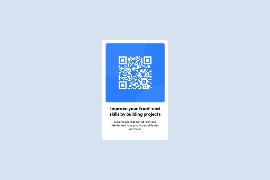
- A better alt text can be
QR Code to frontend mentor website.
- Each page should have an
<h1>heading. However, in some cases (like a QR code component), an<h2>is more appropriate because is not a page and is a card only.
- It's recommended to use a proper CSS reset at the beginning of your styles. Both Andy Bell and Josh Comeau provide excellent CSS resets, which you can easily find online.
- Use
min-height: 100vh;instead ofheight: 100vh;to prevent overflow issues.
- You should not limit
width: 320px;andheight: 499px;for a text container. You only needmax-widthhere.
- Your
font-sizeandmax-widthshould be inremunits instead ofpx. Read more about this here.
- You do not need these margins in your
h1. Just add a padding to your.cardand that's enough.
Marked as helpful1 -
- @wejdenehajiPosted 29 days ago
i think for sizing you can use the google feature measure-it.it helps a lot
Marked as helpful1


Please log in to post a comment
Log in with GitHubJoin our Discord community
Join thousands of Frontend Mentor community members taking the challenges, sharing resources, helping each other, and chatting about all things front-end!
Join our Discord