Not Found
Not Found
Not Found
Not Found
Not Found
Not Found
Not Found
Not Found
Not Found
Not Found
Not Found
Not Found
Not Found
Not Found
Not Found
Not Found
Not Found
Not Found
Not Found
Not Found

Submitted

QR code challenge CSS + HTML. Feedback Welcomed!

LaStellaa 90

@LaStellaa

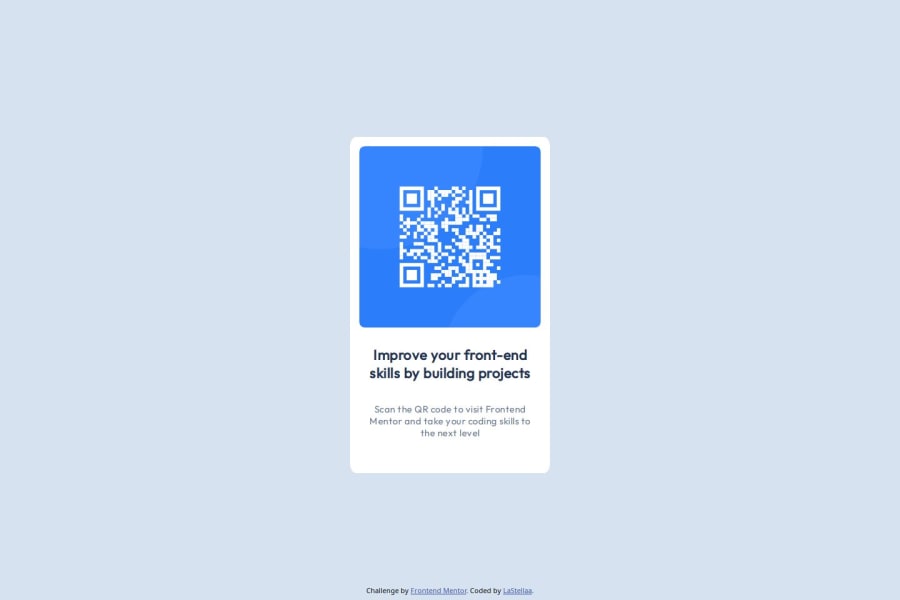
Desktop design screenshot for the QR code component coding challenge

This is a solution for...

  • HTML
  • CSS
1newbie
View challenge

Design comparison


SolutionDesign

Solution retrospective


What are you most proud of, and what would you do differently next time?

I'm proud of the final result of this first project as I am still very new to web development and it feels great to be able to complete a challenge!

What challenges did you encounter, and how did you overcome them?

It took me a few tries to get the easiest HTML in place and I defo had to crack my head a bit with centering items and creating padding.

What specific areas of your project would you like help with?

Right now i am not very confident with the responsiveness of the web pages. It is not very clear which values should i put into the @media brackets? Will keep working on it and practicing!

Community feedback

P

@josifermaodev

Posted

Congratulations, your project is very good!

To help you with this, using Devtools is very important, because with it you can select the desired screen size and make the test changes to it, which you can then apply to your code.

Another important tool is to use relative proportion units

You can make this design responsive without using media queries by using a few different approaches. Here are a few techniques that can help:

1. Flexbox and Grid Layout:

Both are great tools for creating flexible layouts that automatically adjust to the screen size.

2. Relative Units:

Using relative units like em, rem, vw, and vh can make your design more adaptable to different screen sizes.

em and rem: Proportional to the font size of the element or root.

vw and vh: Proportional to the width and height of the viewport.

3. CSS Functions:

CSS functions like calc(), min(), max(), and clamp() help you create dynamic values ​​that adjust to the context.

4. Aspect Ratio:

Maintaining the aspect ratio of elements can help you create designs that automatically adjust.

5. CSS Custom Properties (Variables)

Using CSS variables allows you to dynamically adjust your design based on global variables.

These techniques can help make your design more flexible and adaptable to different screen sizes without relying solely on media queries.

Hope this helps you!

If you have any further questions or concerns, I will be happy to answer them.

Marked as helpful

0

@okeyifea

Posted

The work was great

0

Please log in to post a comment

Log in with GitHub
Discord logo

Join our Discord community

Join thousands of Frontend Mentor community members taking the challenges, sharing resources, helping each other, and chatting about all things front-end!

Join our Discord