QR code challenge by frontend mentor

Solution retrospective
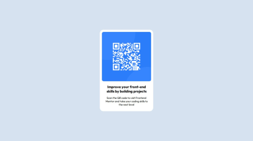
I'm most proud of the clean and responsive design achieved for the QR code component. It effectively communicates the message and provides a visually appealing experience for users.
Next time, I would focus on improving accessibility features. This could involve ensuring proper contrast ratios for text elements, adding ARIA attributes for screen readers, and conducting thorough testing across different assistive technologies. Accessibility is crucial for ensuring inclusivity and reaching a wider audience, so it's an area I would prioritize in future projects.
What challenges did you encounter, and how did you overcome them?Integrating the QR code image posed a challenge as I needed to ensure it was properly sized and displayed without distortion. I addressed this challenge by using CSS to set the image width to 100% of its container, ensuring it scaled proportionally across different screen sizes while maintaining its aspect ratio.
Overall, these challenges were overcome through a combination of experimentation, testing, and leveraging CSS techniques to create a responsive and visually appealing QR code component.
What specific areas of your project would you like help with?I would appreciate feedback on the accessibility of my project. Specifically, I'm interested in suggestions for improving accessibility features such as ensuring proper contrast ratios for text elements, adding ARIA attributes for screen readers, and any other techniques that could enhance the accessibility of the QR code component. Additionally, any insights or tips on conducting thorough accessibility testing across different assistive technologies would be helpful.
Please log in to post a comment
Log in with GitHubCommunity feedback
No feedback yet. Be the first to give feedback on Omkar Jadhav's solution.
Join our Discord community
Join thousands of Frontend Mentor community members taking the challenges, sharing resources, helping each other, and chatting about all things front-end!
Join our Discord