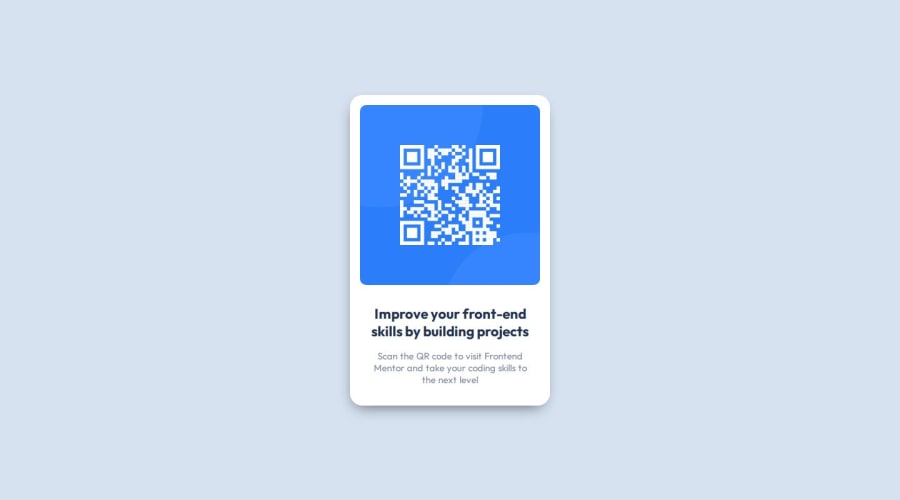
Not Found
Not Found
Not Found
Not Found
Not Found
Not Found
Not Found
Not Found
Not Found
Not Found
Not Found
Not Found
Not Found
Not Found
Not Found
Not Found
Not Found
Not Found
Not Found
Not Found

Submitted

QR Code challenge

N1Dovud 170

@N1Dovud

Desktop design screenshot for the QR code component coding challenge

This is a solution for...

  • HTML
  • CSS
1newbie
View challenge

Design comparison


SolutionDesign

Solution retrospective


What are you most proud of, and what would you do differently next time?

Today, I realized that I had to apply the flexbox to the body instead of the main so that the main becomes centered. I learned more about inheritance and its impace on children from parents.

body {
    display: flex;
    justify-content: center;
    align-items: center;
    height: 100vh;
    background-color: var(--light-gray);
}

Continued development

Unfortunately, I did not quite understand why setting the height of the body to 100vh centered the main content vertically. Logically, I thought as default, the height is always set to 100vh but now I guess there is smth to learn.

What challenges did you encounter, and how did you overcome them?

Creating an item in the center was the difficult part but by learning from others, I managed to fix it!

What specific areas of your project would you like help with?

I am not sure, maybe some advice on building responsive design would be great!

Community feedback

P

@Islandstone89

Posted

HTML:

  • Do not use words like "image" or "photo" in the alt text. Screen readers start announcing images with "image", so an alt text of "image of a qr code" would be read like this: "image, image of a qr code". The alt text must also say where it leads(frontendmentor.io).

  • Remove the <article>, it is not needed.

  • Never have text in divs alone. "Improve your" is a heading, and "Scan the QR code" is a paragraph. And you don't need to wrap any of them in a <div>.

CSS:

  • It's good practice to include a CSS Reset at the top.

  • Add around 1rem of padding on the body, so the card doesn't touch the edges on small screens.

  • On the body, change height to min-height - this way, the content will not get cut off if it grows beneath the viewport. As for the vertical centering, you are correct: while the body takes up the full viewport width, its height is determined by the content. This can seem confusing, especially since the background color applied to the body fills the full viewport. It's one of those things you learn along the way :)

  • gap on the card doesn't do anything, as you haven't declareddisplay: flex.

  • Change width to max-width: 20rem.

  • font-size must never be in px. This is a big accessibility issue, as it prevents the font size from scaling with the user's default setting in the browser. Use rem instead.

  • Paragraphs have a default value of font-weight: 400, so there is no need to declare it.

  • On the image, remove the margin, and change max-width to 100%.

  • To create the space between the image and the edge of the card, set padding on all 4 sides of the card:padding: 1rem;.

Marked as helpful

1

@thisispeterj

Posted

When using display: flex; it converts the container (in this case the body) into a flex container, allowing you to use flexbox properties. However the height of the container will then match the height of the content. Adding the height of 100vh ensures the full viewport is used.

Marked as helpful

1

Please log in to post a comment

Log in with GitHub
Discord logo

Join our Discord community

Join thousands of Frontend Mentor community members taking the challenges, sharing resources, helping each other, and chatting about all things front-end!

Join our Discord