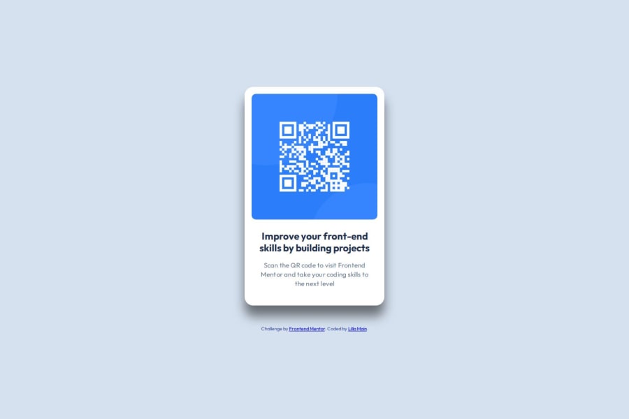
Design comparison
Solution retrospective
There are a couple of things I'm unsure about. I'm not sure if I structured the html properly, same goes for the css declarations. I'm also unsure if I have treated the width/height options properly. Any feedback is welcome!
Community feedback
- @asimsaeed353Posted about 1 month ago
The design is great and looking very fine. Your HTML is properly structured. Although you could have used
<h2>
or<h3>
instead of<p class="text-preset-1">Improve your front-end skills by building projects</p>
.And I suggest not to set max-width at least on
<body>
and avoid setting fixed heights and widths. If you need to set width, try using '%' rather than fixed values. And, it's good to see you have used 'rem' for font sizes.Overall, it's a amazing. Keep up the good work!
Marked as helpful1@lillakmPosted about 1 month ago@asimsaeed353
This is very helpful, thank you! As for the height, I tried not to include it, but I'm unable to vertically center the card on the page using flexbox. I'm probably missing something. Is there a way to get the card in the middle of the page without using the height?
I was thinking about the headings, but went off of the Figma design thinking I should follow the variables that are set in Figma, lol.
0@asimsaeed353Posted about 1 month ago@lillakm To place the card in the middle you can use
body{ display: grid; place-items: center; min-height: 100vh; }
Try this and must let me know if it works.
Marked as helpful1@asimsaeed353Posted about 1 month ago@lillakm Figma file does help a lot in designing but I suggest don't take the variables in the Figma file too seriously. I don't do this at least, lol.
0@lillakmPosted about 1 month ago@asimsaeed353
Works like a charm! Thank you so, so much! I still need to understand when it's better to use grid vs flexbox but this makes so much sense!
0@lillakmPosted about 1 month ago@asimsaeed353
I work on the design side, so I assumed to follow the design, thinking the naming system has been agreed upon... unfortunately, I know it's not exactly true in real life, lol!
0@asimsaeed353Posted about 1 month ago@lillakm Flexbox and grid both have their use cases. I have started using grid more for designing layouts and I'm pretty impressed with the simplicity it offers. Currently, I've designed a layout that I thought would be challenging but grid made it very easy. It helped me get more done with very few lines of codes.
Marked as helpful0@asimsaeed353Posted about 1 month ago@lillakm what I have learnt so far, is there are no hard and fast rules to implement the design. You have to improvise often. And it's great to know you are a designer. Since you already know how to design, you'll be a great addition to the fronted family :). Let me know if you need help with anything. Keep up the good work!
0@lillakmPosted about 1 month ago@asimsaeed353 Thank you so much for all the feedback and I'll keep it in mind to be flexible. It's the same in design :)
1@asimsaeed353Posted about 1 month ago@lillakm Looking forward to more cool designs from you.
0
Please log in to post a comment
Log in with GitHubJoin our Discord community
Join thousands of Frontend Mentor community members taking the challenges, sharing resources, helping each other, and chatting about all things front-end!
Join our Discord