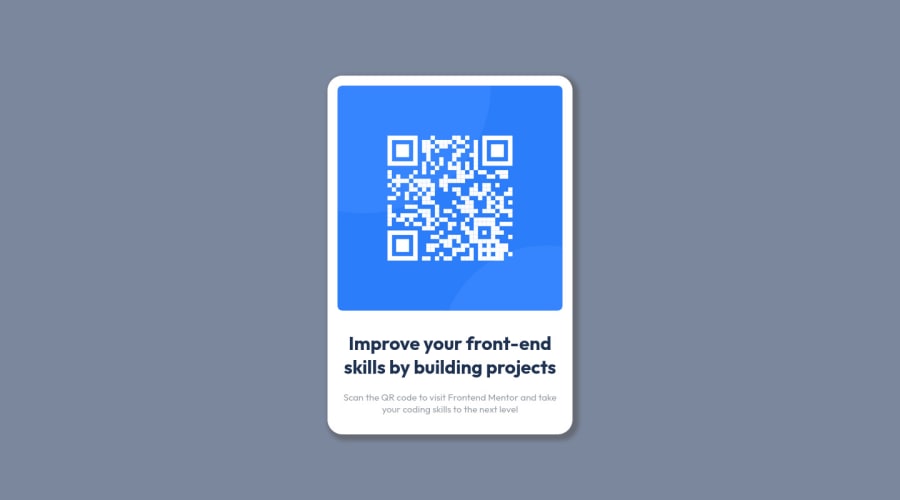
Design comparison
Solution retrospective
I have some question about the best practices as I can't find any to the point explanation or rules to it. I also want to know if using of percentage is ok or not or should I use it a little less.
Community feedback
- @MelvinAguilarPosted almost 2 years ago
Hello there 👋. Good job on completing the challenge !
I have some suggestions about your code that might interest you.
HTML 📄:
- Use semantic elements such as
<main>and<footer>to improve accessibility and organization of your page.
Alt text 📷:
- The
altattribute should not contain the words "image", "photo", or "picture", because the image tag already conveys that information.
-
The
altattribute should explain the purpose of the image. Uppon scanning the QR code, the user will be redirected to the frontendmentor.io website, so a betteraltattribute would beQR code to frontendmentor.ioIf you want to learn more about the
altattribute, you can read this article. 📘.
CSS 🎨:
- In your solution you have only used percentage units once, in this challenge it is enough.
- Instead of using pixels in font-size, use relative units like
emorrem. The font-size in absolute units like pixels does not scale with the user's browser settings. Source 📘.
CSS Reset 🔄:
-
You should use a CSS reset. A CSS reset is a set of CSS rules that are applied to a webpage in order to remove the default styling of different browsers.
CSS resets that are widely used:
I hope you find it useful! 😄 Above all, the solution you submitted is great!
Happy coding!
Marked as helpful1 - Use semantic elements such as
- @HassiaiPosted almost 2 years ago
Replace<div class="main-container">with the main tag and <div class="attribution"> with the footer tag to fix the accessibility issues. click here for more on web-accessibility and semantic html
The body has a wrong background-color. Use the colors that were given in the styleguide.md found in the zip folder you downloaded.
This challenge does not require a box-shadow
To center .main-card on the page using flexbox, replace the height .main-container with min-height: 100vh.
Give h1 and p the same font-size of 15px/0.9375rem, text-align: center, the same margin-left, margin-right and margin-top values. Give p a margin bottom value.
Hope am helpful.
Well done for completing this challenge. HAPPY CODING
Marked as helpful0
Please log in to post a comment
Log in with GitHubJoin our Discord community
Join thousands of Frontend Mentor community members taking the challenges, sharing resources, helping each other, and chatting about all things front-end!
Join our Discord
