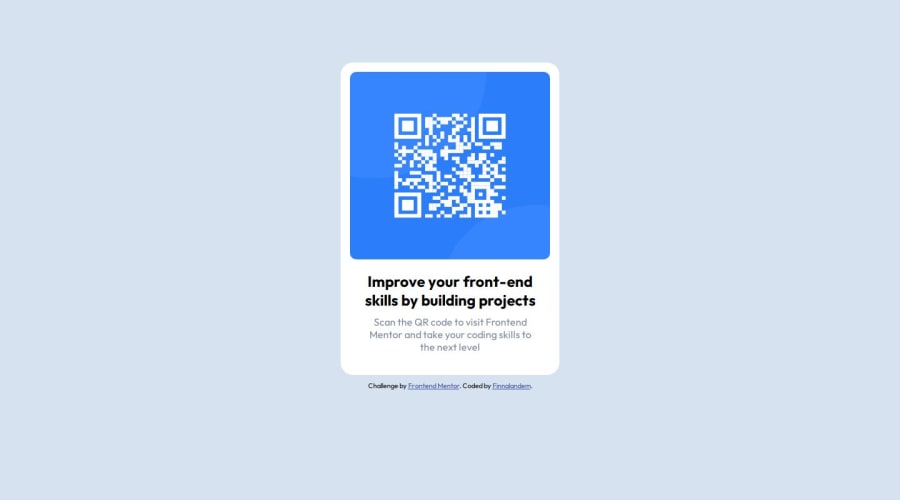
Design comparison
SolutionDesign
Solution retrospective
Not difficult at all.
Community feedback
- @danielmrz-devPosted 9 months ago
Hello @Finnalandem!
Your project looks great!
I have one suggestion for you to improve it even more:
- Using
marginis not the best option to center an element. Here's a very efficient (and better) way to place an element in the middle of the page both vertically and horizontally:
📌 Apply this to the body (in order to work properly, don't use position or margins):
body {
    min-height: 100vh;
    display: flex;  /* it works with grid too  */
    justify-content: center;
    align-items: center;
}
I hope it helps!
Other than that, great job!
0 - Using
- @Jordy01090Posted 9 months ago
Great work, buddy! While the h2 looks good, there's room for improvement to make it closer to the original. Here's what you should add to the style of the h2 element:
font-weight: 600;
color: hsl(218, 44%, 22%);
0
Please log in to post a comment
Log in with GitHubJoin our Discord community
Join thousands of Frontend Mentor community members taking the challenges, sharing resources, helping each other, and chatting about all things front-end!
Join our Discord
