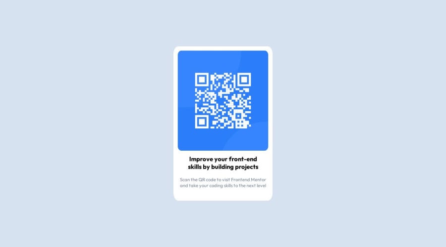
Design comparison
SolutionDesign
Community feedback
- @mayankdrvrPosted about 1 year ago
Congratulations Kelton for completing this challenge. Your design matches the solution very well.
Here is an observation-
- Below 320px width of screen, the text and card gets partially hidden, the text does not wrap and the image does not resize. Maybe, you can make it more responsive by setting the maximum width of card to be upto 100% of width of its parent container. See if using this CSS property in image styling can make the image more responsive-
max-width: 100%; - Avoid using <div> element in html file and use semantic html elements throughout the code for better web accessibility.
- Try to use the Block Element Modifier(BEM) naming method as a good practice of naming classes for referencing html elements in the css file.
Awesome solution and keep it up.
Marked as helpful0 - Below 320px width of screen, the text and card gets partially hidden, the text does not wrap and the image does not resize. Maybe, you can make it more responsive by setting the maximum width of card to be upto 100% of width of its parent container. See if using this CSS property in image styling can make the image more responsive-
Please log in to post a comment
Log in with GitHubJoin our Discord community
Join thousands of Frontend Mentor community members taking the challenges, sharing resources, helping each other, and chatting about all things front-end!
Join our Discord
