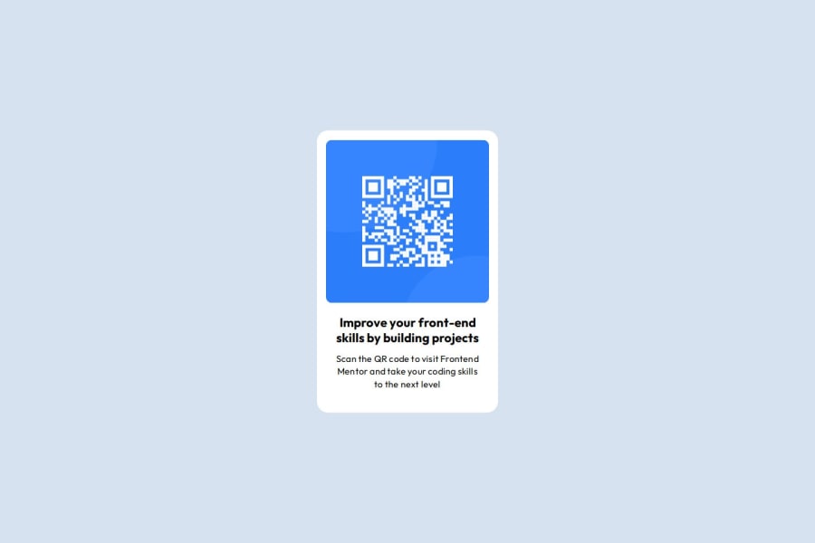
Design comparison
SolutionDesign
Solution retrospective
What are you most proud of, and what would you do differently next time?
The most annoying part was using github ssh key to login from terminal to correct github account
What challenges did you encounter, and how did you overcome them?Still learning layout so.. it looks like example not sure if done w best practices
What specific areas of your project would you like help with?Best practices. It looks ok but no clue i that's the way to do it
Community feedback
- @huyphan2210Posted about 1 month ago
Hi, @duojet2ez,
I checked out your solution and wanted to share some thoughts:
- Many cloud-based platforms that utilize Git, such as GitHub and GitLab, often require SSH keys for secure communication when interacting with repositories. If you find the terminal challenging, consider using Git GUI clients. These visual tools allow you to manage Git repositories without relying on the command line.
- Based on your code, here are some best practices and topics you should research further:
- Semantic HTML: Using meaningful tags helps with accessibility and SEO by clearly defining the structure of your content.
- CSS Naming Conventions: Adopting a consistent naming convention (like BEM) improves code readability and maintainability.
- Responsive Design: Techniques that ensure your site looks good on various screen sizes, making it accessible to all users.
- Mobile-First Approach: Designing for smaller screens first and then progressively enhancing for larger screens can lead to better user experiences.
Hope this helps!
0
Please log in to post a comment
Log in with GitHubJoin our Discord community
Join thousands of Frontend Mentor community members taking the challenges, sharing resources, helping each other, and chatting about all things front-end!
Join our Discord