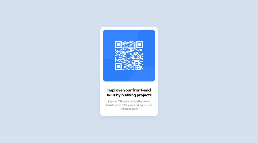
Design comparison
Solution retrospective
I am proud of submitting the QR challenge
What challenges did you encounter, and how did you overcome them?it was a bit harder to me to center the qr code container at the center of the page, the solution is to use flexbox for body tag
What specific areas of your project would you like help with?for now it is alright
Community feedback
- @cvtqxPosted 7 months ago
Your solution looks great!
As someone recommended to me, and I will forward it to you - consider using semantic tags (header, main, footer etc...) instead of divs where appropriate . This will enhance SEO and accessibility.
Great job overall!
Marked as helpful0@Enes-hackerPosted 6 months ago@cvtqx Thanks for motivation, directions and recommendations, I will consider the semantic tags in my future projects!
Happy coding! We are all gonna make it!
0 - @ThiagouhPosted 7 months ago
your code looks great; Concise and organized. There is nothing to highlight to improve
Marked as helpful0 - Account deleted
Hi, congratulations on completing the challenge!
Try to use semantic html ,if possible - after completing the challenge ,look for other people's code .
I hope it helps you!
Have a nice coding!
Marked as helpful0@Enes-hackerPosted 6 months ago@dev-arpitsharma Thanks for the inspiration and helpful advices. I will examine the semantic tags like head, main, footer in my future challenges and projects!
Have a nice day and never give up! Obstacle is the way!
1
Please log in to post a comment
Log in with GitHubJoin our Discord community
Join thousands of Frontend Mentor community members taking the challenges, sharing resources, helping each other, and chatting about all things front-end!
Join our Discord
