QR Code Challenge - HTML, CSS, Flexbox, git, GitHub
Design comparison
Solution retrospective
Overall, I enjoyed the project very much, it was my first Frontend Mentor Challenge. It was my first time using Figma and I enjoyed all the detail the app gives when trying to getting padding, margins, border-radias etc.
Since this is my first challenge, I tried to pay attention to the details in line-height, font-size and font-weight, as well as the sizes of the divs container. I look forward to more challenges.
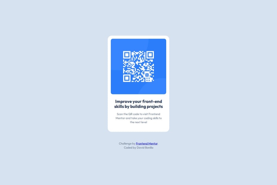
What challenges did you encounter, and how did you overcome them?The biggest challenge I had was when I used live-server on VS Code to preview and I could see the design on the browser, everything looked fine. However when I uploaded the folder to the GitHub repository and Netlify, the QR Code wouldnt show, just the alt text.
I used the Frontend Mentor discord to look for a solution as to why the qr code wouldn't show and I found it! Someone else had the same the issue and another member was kind enough to share his knowledge. It turned out I had the img src file path wrong. It was a simple fix, but it took some time to figure out. Thank you #Weldu for the help.
What specific areas of your project would you like help with?At the moment I would like to develope that developers perspective, or fine tuned eye. After learning HTML and CSS implementing semantic HTML is where I questioned myself on this project. I want that skill to come naturally and I will be working towards that.
Community feedback
- P@kaamiikPosted 2 months ago
- Wrap all of your contents except for the footer inside a
maintag.
Your headings should have a order. You do not need
h1here because this card is not a whole page but afterh1ish2and you should change it toh2.- Try to use a proper CSS reset at the start of your CSS style. Andy Bell and Josh Comeau both have a good one. You can simply search on the internet to find them.
- Use
min-height: 100vh;instead ofheight:100vh;.height: 100vhstrictly limits the height to the viewport size, potentially causing overflow issues if the content is larger than the viewport. On the other hand,min-height: 100vhallows your element to grow in height if the content exceeds the viewport size.
- Never limit your width (
width: 320px;) and height (height: 499px;) in a container or element or tag that contains text inside. When you limit the width and height of elements containing text, you risk the text being cut off, overflowing, or becoming unreadable, especially on smaller screens or when the text dynamically changes. It's generally better to allow the container to adjust its size based on its content or set a flexible size that can adapt to different screen sizes and text lengths. You only needmax-widthhere because it prevents elements from stretching beyond a certain point, keeping them visually appealing across different screen sizes. It ensures your design remains adaptive and doesn't get too wide on larger screens.
- Your
font-sizeandmax-widthshould be inremunit notpx. You can read this article about it and why you should not usepxas a font-size.
Marked as helpful0P@thegrindnetPosted 2 months ago@kaamiik
Thank you Kamran Kiani for taking the time to review my qr code challenge, you have provided a lot of value in this post. I did look up the proper CSS reset by Andy Bell and Josh Comeau, I found a good resource. Everything you posted makes sense and I will be making those changes soon and will be implementing them in future challenges. Again, thank you, I am grateful.
0 - Wrap all of your contents except for the footer inside a
- P@huyphan2210Posted 2 months ago
I forgot to mention: You should learn how to use Browser DevTools, as it's an essential tool for front-end developers. It allows you to inspect and modify HTML, CSS, and JavaScript in real time, debug issues, monitor network activity, and optimize performance. Mastering DevTools helps you efficiently troubleshoot problems and improve the overall quality of your web applications.
Marked as helpful0 - P@huyphan2210Posted 2 months ago
Hi, @thegrindnet,
I’ve reviewed your solution, and I’d like to share my thoughts:
Your HTML could be cleaner and more semantic. For example, some of the div elements are unnecessary and could be replaced with more appropriate elements. The
.containerclass could be changed to amaintag, which semantically represents the primary content of the page (in this case, your card). Additionally, there’s no need to wrap yourh3andptags in adiv, as both are block-level elements and can stand on their own. Also, consider usingh1instead ofh3for the main heading. It's important to establish a clear heading hierarchy: start withh1, followed byh2,h3, etc., as this helps with both readability and SEO.Similarly, the
.attributionclass can be assigned directly to thefootertag, eliminating the need for an extradiv. Since the content inside.attributionisn't a paragraph, using aptag may not be the most appropriate choice. Instead, you can use aspanto wrap those elements.Hope this helps!
Marked as helpful0P@thegrindnetPosted 2 months ago@huyphan2210
Thank you for your feedback. I appreciate the helpful advice. I look forward to implementing these changes to my code soon. I would like to see your code huyphan2210, to return the favor and learn from you.
0 - @DangAnhVuPosted 2 months ago
I think you work very good, I hope I can do better
0
Please log in to post a comment
Log in with GitHubJoin our Discord community
Join thousands of Frontend Mentor community members taking the challenges, sharing resources, helping each other, and chatting about all things front-end!
Join our Discord
