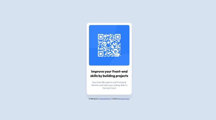
Design comparison
Solution retrospective
Proud I was able to do my first challenge on my own, with little googling. Just improve in general with every challenge I do.
What challenges did you encounter, and how did you overcome them?Just trying to remember how basic things work in general without relying on google constantly. Had to google a few times to get on the right track.
What specific areas of your project would you like help with?Feedback is appreciated.
Community feedback
- @grace-snowPosted 7 months ago
First, I'm going to point you to someone else's feedback on the same challenge as you have a lot of the same issues here, especially in the html.
Looking at your css
- Always use a modern css reset at the start of the styles in every project. Andy Bell or Josh Comeau both have good ones you can look up and use. It's not strictly necessary for such a tiny project but good to get into the habit of including it every time. The reality is you would never work on any project without one in the real world.
- I can see a sort of reset at the top but it's not enough and has a serious problem: Don't set width and height to 100% of html and body. I'm not sure where you got that code snippet from but it can cause bugs especially when using flex/grid to center things in the viewport. It is making the content get cut off on screens with a small height.
- Font size must never be in px. Extremely important!
- the card must not have a width. Instead give it a max width in rem so that it can shrink narrower when it needs to (eg on smaller screens). Using rem also means the card would scale correctly for all users including those who have a different text size.
Marked as helpful0@Brstone2002Posted 7 months ago@grace-snow Thank you. I knew something was wrong because it was cutting the top off a little when the screen was scaled small and I couldn't figure out why. After reading thru what you linked to I think I may know how to fix it. Going to play around with it again. I also knew about not using <div> for everything and about using <main> and such for proper structure, just didn't think it was a big deal on such a small project, but I do see where I should start using it even on the small ones just to get the repetition in. Thanks again.
0 - @ildi0818Posted 7 months ago
I'm not experienced, so unfortunately I can't give you advice.
0
Please log in to post a comment
Log in with GitHubJoin our Discord community
Join thousands of Frontend Mentor community members taking the challenges, sharing resources, helping each other, and chatting about all things front-end!
Join our Discord