Design comparison
SolutionDesign
Solution retrospective
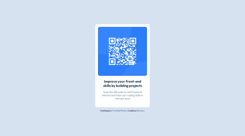
I struggled to center the card but thanks to the FM community I finally did it! Another thing I learned is that I have to first reset my CSS before and design after.
Thank you a lot for this challenge
Community feedback
- @0xabdulkhaliqPosted over 1 year ago
Hello there 👋. Congratulations on successfully completing the challenge! 🎉
- I have other recommendations regarding your code that I believe will be of great interest to you.
CSS 🎨:
- Looks like the
<footer">
element has been placed bottom usingmargin
. So let me explain, How you can place the component at bottom with usingfixed
positioning forfooter
- Luckily you already used
Flex
layout ofcss
to center the component, So you just want to addfixed
position for<footer>
element to place it in bottom of the page
footer { position: fixed; bottom: 1em; }
- Now remove these styles, after removing you can able to see the changes
.attribution { margin-top: 0.75rem; }
- Now your component has been properly at bottom
.
I hope you find this helpful 😄 Above all, the solution you submitted is great !
Happy coding!
1@bienvenudevPosted over 1 year agoHey @0xAbdulKhalid, I did it but the only problem is that when I click Inspect in chrome, the footer goes up which doesn't look good on the design! Should I be concerned or it's not that big of a deal?
0
Please log in to post a comment
Log in with GitHubJoin our Discord community
Join thousands of Frontend Mentor community members taking the challenges, sharing resources, helping each other, and chatting about all things front-end!
Join our Discord