

Design comparison

Solution retrospective
I'm proud to successfully go from a design to a fully coded and deployed application via GIT, Github, and Netlify -- which were all new skills to learn.
In the future, I'm going to explore using calculated/percentage based values. Also setting up environment variables/common styling variables.
What challenges did you encounter, and how did you overcome them?A lot of my biggest issues were dealing with flexbox & understanding how settings are inherited + how align/justify attributes work for containers/divs vs text.
Google searching and Test and Checking from different angles (adding values on inside vs outside of the "border" that I'm trying to grow/shrink).
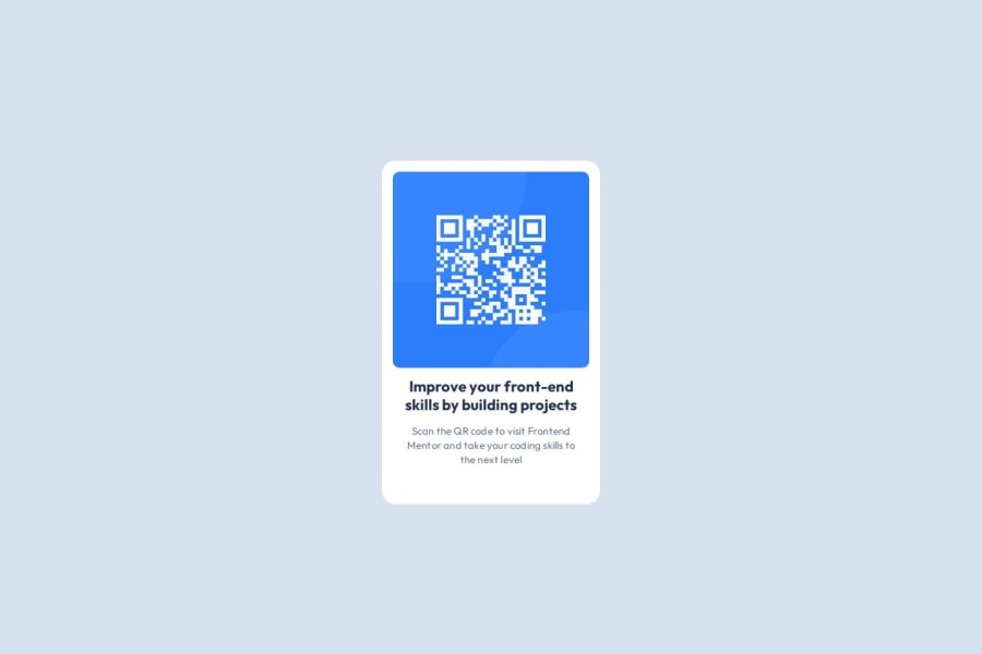
What specific areas of your project would you like help with?I would be interested in understanding more regarding how this project could have improved mobile responsive build. Going down to 320px width, I couldn't quite figure out how to maintain the body background color margin on the sides --- but perhaps I shouldn't because that would have required shrinking the QR code proportionally?
Community feedback
Please log in to post a comment
Log in with GitHubJoin our Discord community
Join thousands of Frontend Mentor community members taking the challenges, sharing resources, helping each other, and chatting about all things front-end!
Join our Discord