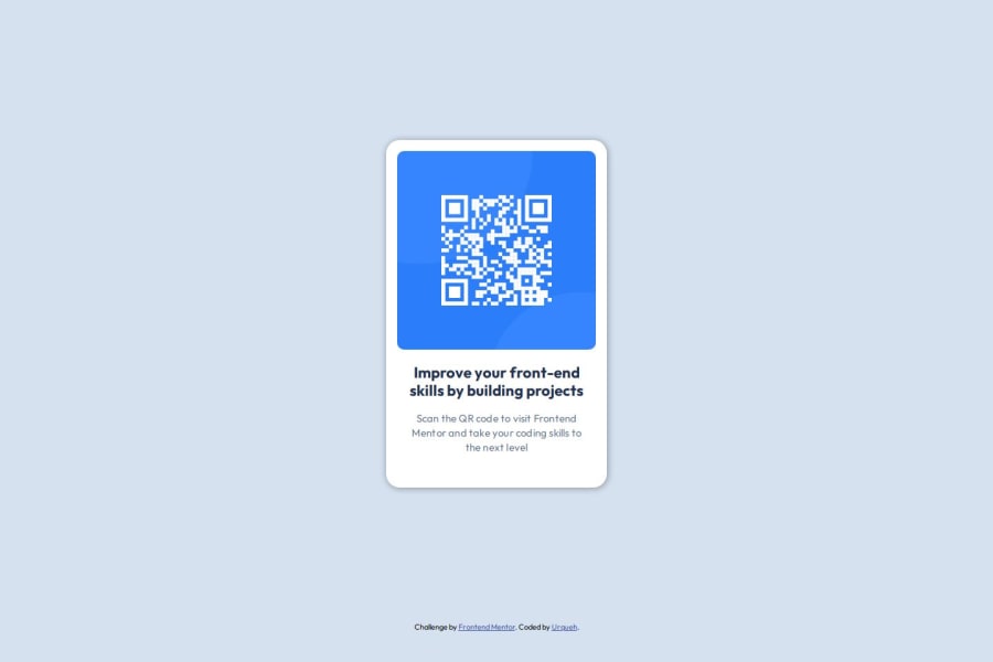
Design comparison
Community feedback
- @Danny-AgyeiPosted 6 months ago
Hello there👋,
You did great by taking this challenge👍
I would like to suggest you take a look at the responsiveness of the card, especially at a screen width of 320px, which you might want to consider.
Another thing is that the card isn't centered vertically. You did great using the BEM methodology, but the approach isn't quite correct. Here’s a link to help you with BEM - BEM methodology
.card { /* Block */ }
.card__img { /* Element */ }
.card__title { /* Element */ }
Another approach to center the card is to wrap it in a container and style it like this:
.container {
    display: flex;
    align-items: center;
    justify-content: center;
    width: 100%;
    height: 100vh;
}
If you’d like to compare with another solution using the BEM method for the same task, you can view the GitHub repository here
Hope you find this helpful.
Happy coding😊!
0
Please log in to post a comment
Log in with GitHubJoin our Discord community
Join thousands of Frontend Mentor community members taking the challenges, sharing resources, helping each other, and chatting about all things front-end!
Join our Discord
