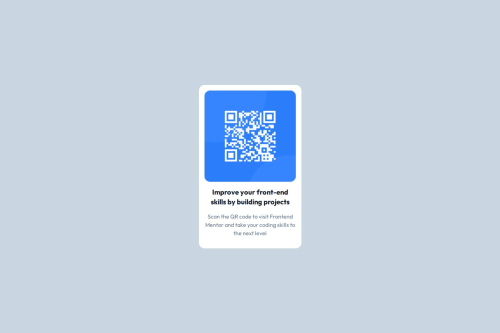
Submitted 9 months agoA solution to the QR code component challenge
QR code card using tailwindcss
tailwind-css
P
@NunoJDMachado

Solution retrospective
What are you most proud of, and what would you do differently next time?
Things I'm proud of:
- Learning to install tailwindcss on a new project
- Using flexbox efficiently
- Extending custom CSS classes to tailwindcss
Things I'd do differently next time:
- Avoid fixed widths
- Download font files from google fonts
-
Tried installing tailwindcss using vite but ran into some error. Using tailwind CLI worked.
-
Was initially using classes like w-1/4, w-1/2, etc., but noticed that on smaller screen sizes the card was getting too narrow. Went for fixed width instead.
- I would like to know whether this approach of using fixed widths is valid. I just tried to eyeball the width of the card from the design screenshot and typed some width in pixels. Upon testing it seems to be working on all screen sizes, but surely there must be a more optimal way? Is there a better practice like using min width, percentages or something?
Code
Loading...
Please log in to post a comment
Log in with GitHubCommunity feedback
No feedback yet. Be the first to give feedback on NunoJDMachado's solution.
Join our Discord community
Join thousands of Frontend Mentor community members taking the challenges, sharing resources, helping each other, and chatting about all things front-end!
Join our Discord