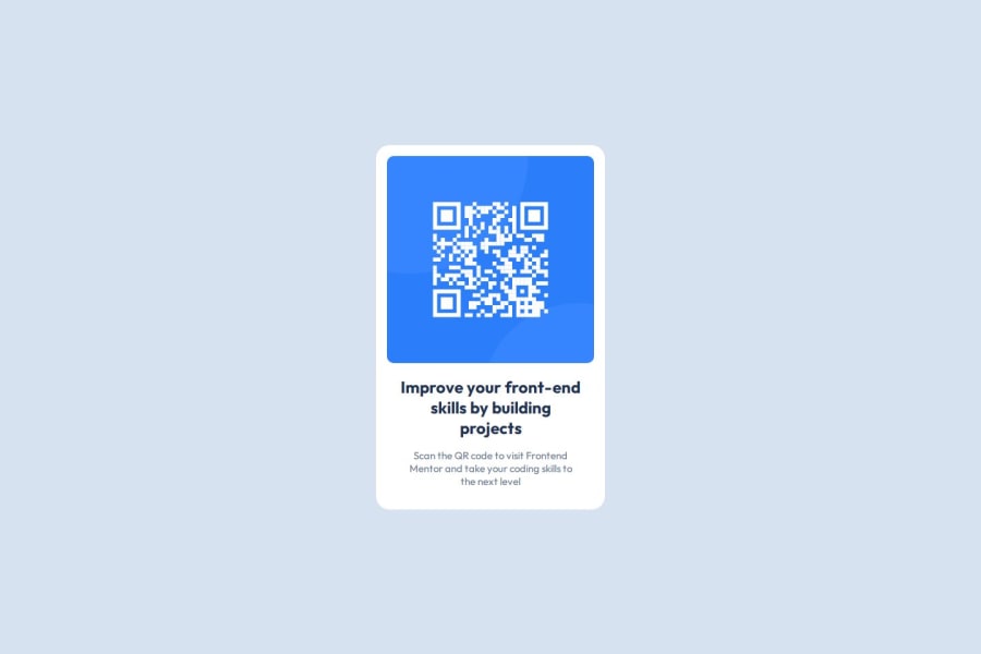
QR code card using html and internal CSS styling


Design comparison

Community feedback
- @bhuvi819381Posted 2 months ago
Code Review Feedback
Hello,
I checked your code, and it’s perfect! Great job! 😄
Here are a few suggestions to make it even better:
-
Use at least one
<h1>tag
Every page should have a single<h1>to improve structure and accessibility. -
Avoid using
pxfor units
Use relative units likeremoremfor better scalability and responsiveness. -
Add some top margin to the
<p>tag
This will improve the spacing and make the layout look cleaner.
Other than these, everything looks fantastic. Keep up the great work!
Marked as helpful1 -
- @MarziaJaliliPosted 2 months ago
Nicely done!!!,
The solution looks AWESOME!!!
For this layout, you could use
gridinstead offlexbox.Two mean reasons:
- First, the size every child element takes is the same, isn't it?
- Your code will look much cleaner, just the TWO lines below, man!
display: grid;
place-items: center;
Hope this improves your next projects😎
Marked as helpful1


Please log in to post a comment
Log in with GitHubJoin our Discord community
Join thousands of Frontend Mentor community members taking the challenges, sharing resources, helping each other, and chatting about all things front-end!
Join our Discord