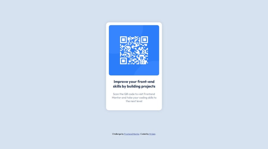
Design comparison
SolutionDesign
Solution retrospective
Just getting started here ; )
Community feedback
- @danielmrz-devPosted 10 months ago
Hello @sakr2000!
Your project looks great!
I noticed that you used
marginto place the card in the middle of the page. Here's a very efficient (and better) way to center the card:- Apply this to the body (in order to work properly, don't use position or margins):
body {
    min-height: 100vh;
    display: flex;
    justify-content: center;
    align-items: center;
}
I hope it helps!
Other than that, great job!
0
Please log in to post a comment
Log in with GitHubJoin our Discord community
Join thousands of Frontend Mentor community members taking the challenges, sharing resources, helping each other, and chatting about all things front-end!
Join our Discord
