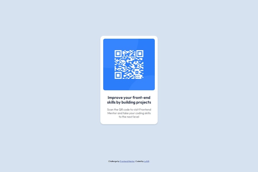
Design comparison
Solution retrospective
my solution is 99% like the design
What challenges did you encounter, and how did you overcome them?Cannot grasp the spacing, font line-height, the padding just from plain image. So i recreate the figma file
What specific areas of your project would you like help with?on responsive solution
Community feedback
- @grace-snowPosted 3 months ago
Hi
There are a few foundational principles missing in this that it's good to correct early on:
- All content should be contained within landmarks. This should be inside a
mainand the attribution inside afooter(the footer as a sibling of the main, not a child of it). - The image in this challenge is extremely important content. The
altdescription needs to say what the image is (QR code) and where it goes (to FrontEndMentor.io). Remember,alton images is human readable content, not code. This post is worth reading: https://www.craigabbott.co.uk/blog/how-to-write-good-alt-text-for-screen-readers/ - I strongly advise against changing the HTML/root font size to
font-size: 62.5%;. I've written up a full post about why this is unnecessary and potentially damaging for accessibility and for teamwork: https://fedmentor.dev/posts/rem-html-font-size-hack/ - The body never needs a restricted max-width. Think of it as the piece of paper every design goes on, or the screen people view on. It's not your job to limit that to a smaller area, especially not in pixels.
- Make sure you get into the habit of including a FULL modern CSS reset at the start of the styles in every project you do. Andy Bell and Josh Comeau have good ones with blogs explaining why they've included what they have.
- Don't use large margins like
20rem autoto try and center a component on the screen. Instead, make the body and/or main a flex column and use flex properties to center. What you have currently would make the component sit way off screen on mobiles, forcing people to scroll for no reason, and make it sit in a strange position on larger screens too. Again, it's not your job to try and handle the screen the end user is using. This is a nice article about centering with CSS: https://moderncss.dev/complete-guide-to-centering-in-css/ - I don't think you should be using
remunits for the padding on the card. Make sure you understand the implications of each unit you use. If using rem and a user changes their default text size, these paddings would also increase, making the content area potentially very narrow on some screens. Instead, consider using pixels. Or you can go a bit fancy and use a clamp() or max() or min() CSS function, but I think that's overkill here to be honest. - Note, it's certainly not wrong, but is less common to use
remfor line height. Usually it's unitless like 1.5. If you want to go unitless or use % you calculate it by dividing the line height by the font size. E.g. 24px line height and 16px font size is 24/16 =line-height: 1.5. - give the boddy a little padding (e.g. in pixels) to make sure this card can never hit the screen edges.
Marked as helpful1@kankaGatePosted 3 months ago@grace-snow Thank you so much for your thoughtful feedback!
Your point about the 62.5%
font-size, will check your link. I thought it was the solution for acommodating fluid sizing.And it is not necessary to use only one same measuring unit, but depends on what we are sizing, noted.
Do you have any link for best practice/rule/formula to decide which
line-heightfor different uses? as i found many theories but still not certain which one to implement.—thanks again!
0@grace-snowPosted 3 months ago@kankaGate You don’t need a rule/formula. Line heights are included in designs, which you will always have when working.
1 - All content should be contained within landmarks. This should be inside a
- @dylan-dot-cPosted 4 months ago
Hey! Well done on this solution, it looks great, but there are a few ways you can improve...
Before that, I dont know what you mean by recreating the figma file, but you didnt need to as its actually a
FREE+challenge that gives you the figma file for free. Anyways...- Centering: I see you used margins but there is a better way to center by user,
flex, orgridto get the page centered. It's better to do that than margin. And with that you dont need the max-width of1440pxas on really large screens it still wont center properly. - Semantic HTML: You can use semantic tags like
main,articleandsectionto make it easier for screen readers. Also you could be more descriptive with the img alt by telling the user what it points to and so on.
ANyways have a great rest of your day! May God bless you!
Marked as helpful1@kankaGatePosted 4 months ago@dylan-dot-c i recreate the figma files because i can't download it...
for centering, i will definitely use your sugestion on the next challenge
on semantic, iam working on it so it will become my habit everytime iam coding.
thank you for your helpful feedback!
1@kankaGatePosted 4 months ago@dylan-dot-c yes, everytime i tried to download, i got time out message like this: frontendmentor.nyc3.digitaloceanspaces.com took too long to respond.
0@dylan-dot-cPosted 4 months ago@kankaGate that's weird Cóuld be some internet or vpn issue Idk There are 2 more free+ out there try it with them and see if it works
0@kankaGatePosted 4 months ago@dylan-dot-c well, i got timeout for both of them. now i can download them using vpn
1 - Centering: I see you used margins but there is a better way to center by user,
Please log in to post a comment
Log in with GitHubJoin our Discord community
Join thousands of Frontend Mentor community members taking the challenges, sharing resources, helping each other, and chatting about all things front-end!
Join our Discord
