Design comparison
SolutionDesign
Solution retrospective
📌Please, feel free to leave a comment with tips so I can do it better.
Thank you for visiting!🤘
Community feedback
- @Danish49Posted over 1 year ago
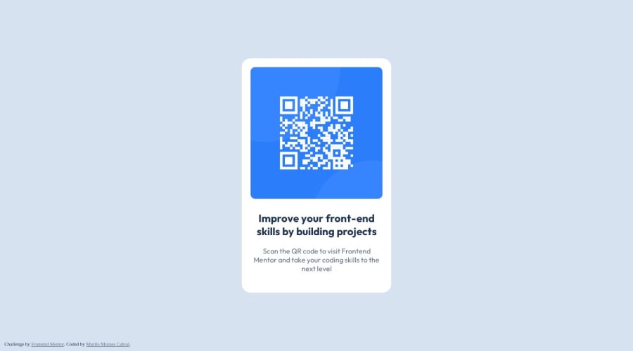
I feel there might be no need of a enclosing all elements in a section you could have kept the image in the main tag alone and text elements in a div , design is slightly bigger pay attention to it But above all your design looks great 👍🏻 Keep coding
Marked as helpful1
Please log in to post a comment
Log in with GitHubJoin our Discord community
Join thousands of Frontend Mentor community members taking the challenges, sharing resources, helping each other, and chatting about all things front-end!
Join our Discord
