

Design comparison
SolutionDesign

Community feedback
- @nadam-designPosted 3 months ago
Hi @Aliphia!
Great job on the implementation! However, the devil is in the details, and I noticed a few small discrepancies compared to the design:
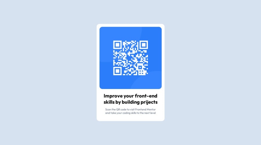
- The width of the component is slightly different from what is specified in the design (375px vs 320px).
- The border-radius of the component is set to 1rem, while the design shows 2rem (you can tell because the QR code container also has a border-radius of 1rem, which makes it look a bit odd...).
- The bottom margin of the title is 15px in your code, but the design specifies 16px.
- You're mixing rem and px units in places, and it would be better to stick to one unit, ideally rem, for consistency across the project.
If you fix these little details, the result will be perfect! Keep up the great work!
0

Please log in to post a comment
Log in with GitHubJoin our Discord community
Join thousands of Frontend Mentor community members taking the challenges, sharing resources, helping each other, and chatting about all things front-end!
Join our Discord