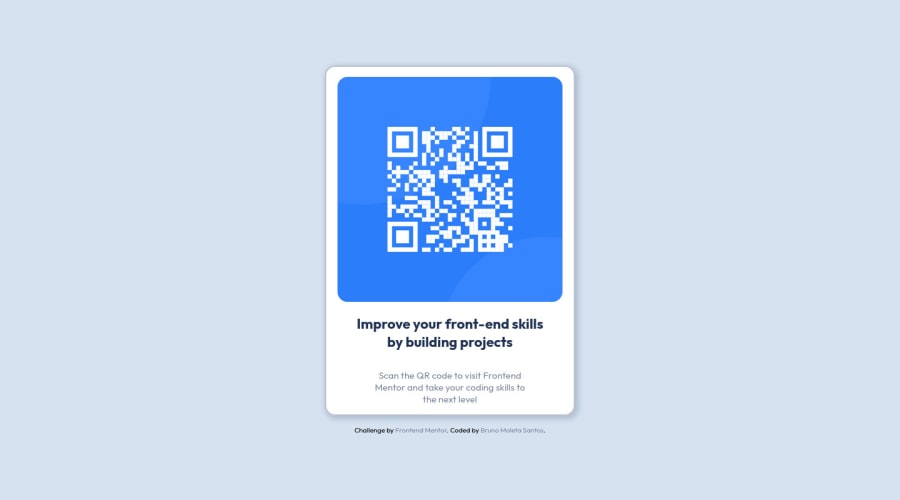
Design comparison
Solution retrospective
I set the text under the QR Code with:
/* parent */ .card { position: relative; } /* child */ #text { position: absolute; bottom: 0;
I wonder if there's a more flexible way to position the #text
inside the parent.
Community feedback
- @ecemgoPosted over 1 year ago
Some recommendations regarding your code that could be of interest to you.
HTML
- In order to prevent the bugs due to styles, you can remove the
<figure>
,<figcaption>
and<div id="text">
. In fact, you don't need to use them. The html structure should be like this:
<body> <main class="card"> <img src="./images/image-qr-code.png" alt="QR code" /> <h1>Improve your front-end skills by building projects</h1> <p> Scan the QR code to visit Frontend Mentor and take your coding skills to the next level </p> </main> </body>
CSS
- In order to center the card correctly, you'd better add flexbox and
min-height: 100vh
to thebody
- For the color of the screen, you can use the recommended color in the
body
body { display: flex; flex-direction: column; justify-content: center; align-items: center; min-height: 100vh; }
- If you use flexbox in the
body
, you don't need to use flexbox andposition: relative
in the.card
to center the card - If you use
max-width
instead ofwidth
andheight
, the card will be responsive - You'd better give
padding
to give gap between the content and the border of the card
.card { /* display: flex; */ /* flex-direction: column; */ /* align-items: center; */ /* width: 25rem; */ max-width: 20rem; /* height: 35rem; */ /* position: relative; */ padding: 1rem; }
- In addition to that above, in order to make the card responsive and the image positioned completely on the card, you'd better add
width: 100%
anddisplay: block
for the img in this way:
img { /* height: 22.5rem; */ /* width: auto; */ width: 100%; display: block; border-radius: 1rem; /* display: flex; */ /* justify-content: center; */ }
- You don't need to give width to the texts and you can remove them.
- You can add
text-align: center
to make texts centered
h1 { /* width: 20ch; */ text-align: center; }
p { /* width: 26ch; */ text-align: center; }
- Finally, you don't need these styles below. You can remove them in order to clean the code and avoid repetition.
/* #central { display: flex; flex-direction: column; align-items: center; justify-content: center; min-height: 98vh; } */ /* figcaption{ display: none; } */ /* #text { position: absolute; bottom: 0; text-align: center; display: flex; flex-direction: column; align-items: center; } */
Hope I am helpful. :)
Marked as helpful1@brunomoletaPosted over 1 year ago@ecemgo Thanks for taking the time and helping me out,
best regards from Brazil :)
1 - In order to prevent the bugs due to styles, you can remove the
- @pperdanaPosted over 1 year ago
Hello there 👋. Congratulations on successfully completing the challenge! 🎉
- I have some additional recommendations for your code that I think you'll find interesting and valuable.
📌 Add
<footer>
tag as semantic HTML in code-
The
<footer>
tag is another semantic HTML element that is used to define the footer section of a web page. -
The
<footer>
tag should be used to wrap the content that appears at the bottom of a web page, such as copyright notices, contact information, or links to other pages.
for example code:
<footer class="attribution"> Challenge by <a href="https://www.frontendmentor.io?ref=challenge" target="_blank">Frontend Mentor</a>. ................................. </footer>
In the example above, the <footer> tag is used to wrap the copyright notice, which is the content that appears at the bottom of the web page. This tells both human readers and search engines that the content inside the <footer> tag is the footer section of the web page.
I hope you found this helpful!
Happy coding🤖
0 - @Bader-IdrisPosted over 1 year ago
You can set the container in the middle of the screen whatever user changes it when you add these properties to it in CSS:
.container { position: absolute; top:50%; left: 50%; transform: translate(-50%, -50%); }
the new feature is transform, it has many lovely properties you can discover, I personally love it. Hope it's useful
0
Please log in to post a comment
Log in with GitHubJoin our Discord community
Join thousands of Frontend Mentor community members taking the challenges, sharing resources, helping each other, and chatting about all things front-end!
Join our Discord