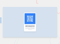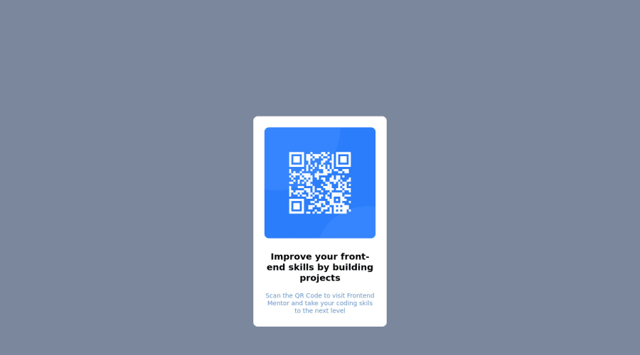
Design comparison
Solution retrospective
I used the card with relative positioning and everything inside it had absolute positioning. Everything went great but I could not center the card vertically at the end. That is the one difference I have with the original thing.
Community feedback
- @subu-vPosted over 2 years ago
Just remove the from your .card element.
  position: relative;
  left: 50%;
  transform: translate(-50%, 50%);
You can easily center any element inside of the body element which is parent to the all consecutive elements.
Use the below code on the body element,
height: 100vh; display: flex; justify-content: center; align-items: center;- In order to center a element vertically inside of a body element, the body element should have space in order to center anything vertically.
2)Now setting height:100vh on the body element, make the height of the body to 100% of the viewport height (viewport height: the maximum height of the screen you see on your computer).
3)f you haven't set the height to 100vh, the height of the body will be the height of the content available.You can see this in your dev tools, first see the height of the body before using height:100vh, then see the difference when you use height:100vh
If you're new to the world of html and css, it's okay. Learn flex-box, and you''ll know what display:flex, ect those lines of code does.
1
Please log in to post a comment
Log in with GitHubJoin our Discord community
Join thousands of Frontend Mentor community members taking the challenges, sharing resources, helping each other, and chatting about all things front-end!
Join our Discord

