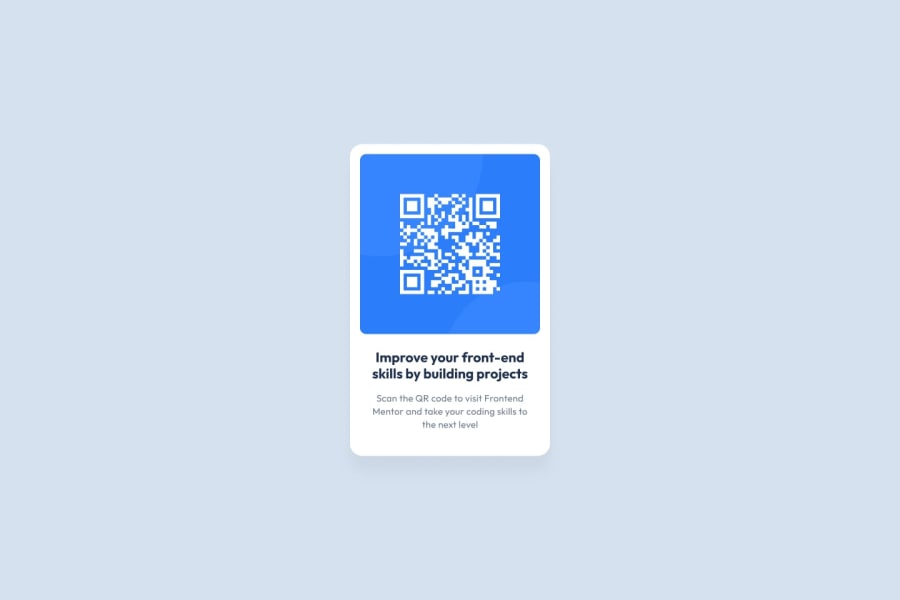
Design comparison
SolutionDesign
Solution retrospective
What are you most proud of, and what would you do differently next time?
FEEDBACKS ARE WELCOMED
Community feedback
- @ArpitTheSlayerPosted about 1 month ago
There are three you can improve on:
- The box-shadow is too dark you should use a lighter color to make it less jarring. And the background color of the body is a bit too light, the color given by Frontend Mentor is better.
- The contrast ratio of the paragraph element is not good, you should make it darker for people with poor eyesight.
- In your css file there are many empty media queries that are not necessary. Remove them since they just confuse others who review your code and is generally not seen as good practice.
0
Please log in to post a comment
Log in with GitHubJoin our Discord community
Join thousands of Frontend Mentor community members taking the challenges, sharing resources, helping each other, and chatting about all things front-end!
Join our Discord
