

Design comparison

Solution retrospective
mainly would like advice on my CSS as i find it the most difficult right now, and i've also never used github so if i did anything wrong in that aspect please let me know!
Community feedback
- P@Islandstone89Posted 9 days ago
Hello, good job.
Here are some suggestions :)
HTML:
-
Every webpage needs a
<main>that wraps all of the content, except for<header>andfooter>. This is vital for accessibility, as it helps screen readers identify a page's "main" content. Wrap the card in a<main>. -
You don't need to wrap the image in a
<div>. -
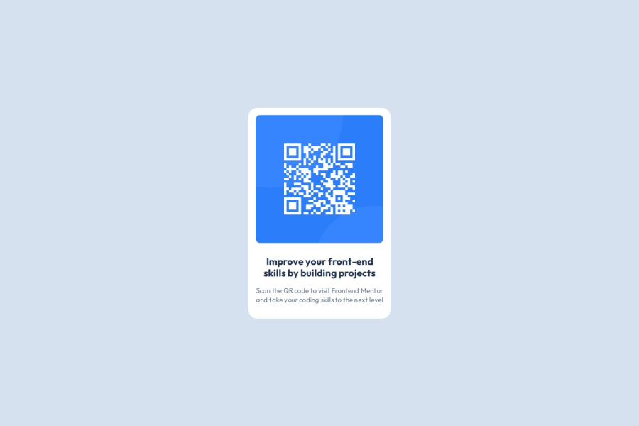
The alt text must also say where it leads(the frontendmentor website). A good alt text would be "QR code leading to the Frontend Mentor website."
-
I would change the heading to a
<h2>- a page should only have one<h1>, reserved for the main heading. As this is a card heading, it would likely not be the main heading on a page with several components. -
It's common to give elements a class instead of an
id. Here are some examples of when to use theidattribute.
CSS:
-
Make a habit of including a modern CSS Reset at the top of the stylesheet.
-
I recommend adding a bit of
padding, for example16px, on thebody, to ensure the card doesn't touch the edges on small screens. -
Move
font-familytobody. -
On the
body, changeheighttomin-height: 100svh— this way, the content will not be cut off if it grows beneath the viewport. -
Remove the margin on the card - it is already centered using Flexbox.
-
Remove the
heightinpxon the card. You should never set a fixed size on elements containing text, as it will cause overflow if the text grows taller than the set size. -
max-widthon the card should be in rem. Around20remworks well. -
font-sizemust never be in px. This is a big accessibility issue, as it prevents the font size from scaling with the user's default setting in the browser. Use rem instead. -
letter-spacingmust also not be inpx. You can useem, where1emequals the element's font size. -
Since all of the text should be centered, you only need to set
text-align: centeron the body, and remove it elsewhere. The children will inherit the value. -
On the image, add
display: block,height: autoandmax-width: 100%- the max-width prevents it from overflowing its container. Without this, an image would overflow if its intrinsic size is wider than the container.max-width: 100%makes the image shrink to fit inside its container.
Marked as helpful1P@jellmooPosted 8 days ago@Islandstone89 thank you so much for your feedback! i will update my code accordingly
1P@Islandstone89Posted 7 days ago@jellmoo Good job!
Not to be nit-picky, but there are a few things you missed :)
HTML:
- The
<main>must be inside of thebody, like this:
<body>
  <main>
    <div class="container">
      <img src="https://i.postimg.cc/3x8tHdg4/QR-Image.png" alt="QR Code leading to the Frontend Mentor Website"/>

      <div class="words">
        <h2 class="title">Improve your front-end skills by building projects</h2>
        <p class="description">Scan the QR code to visit Frontend Mentor and take your coding skills to the next level</p>
      </div>
    </div>
  </main>
</body>
Here is some more info about the
<main>landmark.CSS:
-
Remove
margin: autoon the card and on the image, as none are needed. -
As the design doesn't change, there is no need for any media queries. When you do need them, they should be in
remorem, notpx. Also, it is common practice to do mobile styles first and use media queries for larger screens.
Keep up the good work :)
Marked as helpful0 -
- @PorcunanetPosted 10 days ago
test
0


Please log in to post a comment
Log in with GitHub
Join our Discord community
Join thousands of Frontend Mentor community members taking the challenges, sharing resources, helping each other, and chatting about all things front-end!
Join our Discord