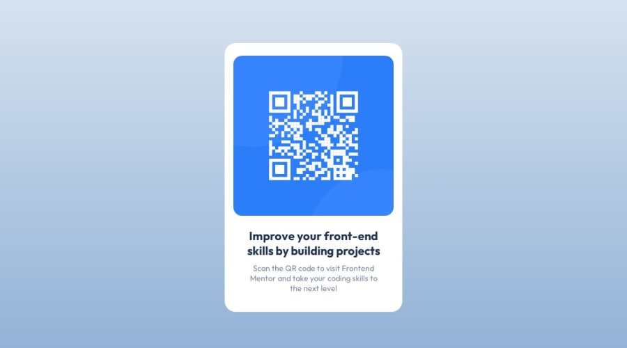
Design comparison
Solution retrospective
This project was not really hard So I think I'm ready to move onto harder projects now.
Community feedback
- @0xabdulkhaliqPosted over 1 year ago
Hello there π. Congratulations on successfully completing the challenge! π
- I have other recommendations regarding your code that I believe will be of great interest to you.
HEADINGS β οΈ:
- This solution consists incorrect usage of
<p>
so it can cause severe accessibility errors due to incorrect usage of paragraph<p>
- Every site must want only one
h1
element identifying and describing the main content of the page.
- An
h1
heading provides an important navigation point for users of assistive technologies, allowing them to easily find the main content of the page.
- In this solution there's
<p>
element which is this<p>Improve your...</p>
, you can preferably use<h1>
instead of<p>
. Remember<h1>
provides an important navigation point for users of assistive technologies so we want to use it wisely
- So we want to add a level-one heading to improve accessibility
- Example:
<h1>Improve your front-end skills by building projects</h1>
- If you have any questions or need further clarification, and feel free to reach out to me.
- If you have any questions or need further clarification, you can always check out
my submission
and/or feel free to reach out to me.
.
I hope you find this helpful π Above all, the solution you submitted is great !
Happy coding!
Marked as helpful1@MrNikaaPosted over 1 year ago@0xAbdulKhalid Thanks, I Will be improving the code tomorrow!
0 - @VCaramesPosted over 1 year ago
Hey there! π Here are some suggestions to help improve your code:
- Every site should ALWAYS have β
a
main
element not only for semantic purposes but also to help assistive technology find the main content of your content. For this challenge, it will serves as the componentβs container β οΈ.
More Info: π
- The
alt tag
description for the βQR imageβ needs to be improved upon β οΈ. Its needs to tell screen reader users where it will take them to when they scan it.
- The "Improve your front-end skill by building projects" is a heading β οΈ in this component, so should be wrapped in an heading element.
- The web development process can be made easier and expedite the process π by implementing a
CSS Reset
. Here are some examples that you can freely use π: Josh Comeau Reset, Eric Meyer Reset
- Change β οΈ
width
tomax-width
in your componentβs container to make it responsive. You will also want to remove theheight
as it is unnecessary.
- Move all of these elements to the
body
and change theheight
tomin-height
;
.wrapper { display: flex; align-items: center; justify-content: center; height: 100vh; }
- Not necessary;
.info { width: 85%; }
- There is no need to repeat code. Instead apply
text-align: center;
andfont-family: 'Outfit', sans-serif;
to the.container
.
If you have any questions or need further clarification, feel free to reach out to me.
Happy Coding! πΎ
Marked as helpful1 - Every site should ALWAYS have β
a
- @KingSkyrosPosted over 1 year ago
I think you should use this instead for background-color
body{ background: hsl(212, 45%, 89%); }
1@MrNikaaPosted over 1 year ago@KingSkyros I Wanted to try adding an animated gradient and used chatGPT for it since I have no experience using keyframes yet but it did not work. That is why I'm using a gradient.
0
Please log in to post a comment
Log in with GitHubJoin our Discord community
Join thousands of Frontend Mentor community members taking the challenges, sharing resources, helping each other, and chatting about all things front-end!
Join our Discord