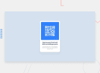
Design comparison
Solution retrospective
I'm most proud of finnishing the project, and would have taken more time to ad the circles
What challenges did you encounter, and how did you overcome them?Adding the circels
What specific areas of your project would you like help with?I would like to know if anyone added the oval circels and how they did to make them work, was it with z-index or somthing else?
Community feedback
- @LuisVera1Posted 8 months ago
Hi Daniel
Your solution looks very good, but I don't understand, which circles?.
I see you are using react, in this case, you don't need to edit in yout index.html, your code must be in the App.jsx
keep up the good work!
0@DanielNevadoKPosted 7 months agoHi @LuisVera1 !
if you look carfully on the blue bg on the top left corner and bottom right corner, you can see half circles.
Oh yes! Thank you for the feedback toatelly forgott about writeing it in jsx haha
0
Please log in to post a comment
Log in with GitHubJoin our Discord community
Join thousands of Frontend Mentor community members taking the challenges, sharing resources, helping each other, and chatting about all things front-end!
Join our Discord

