Not Found
Not Found
Not Found
Not Found
Not Found
Not Found
Not Found
Not Found
Not Found
Not Found
Not Found
Not Found
Not Found
Not Found
Not Found
Not Found
Not Found
Not Found
Not Found
Not Found

Submitted

QR-Code Card Component

manamasu 10

@manamasu

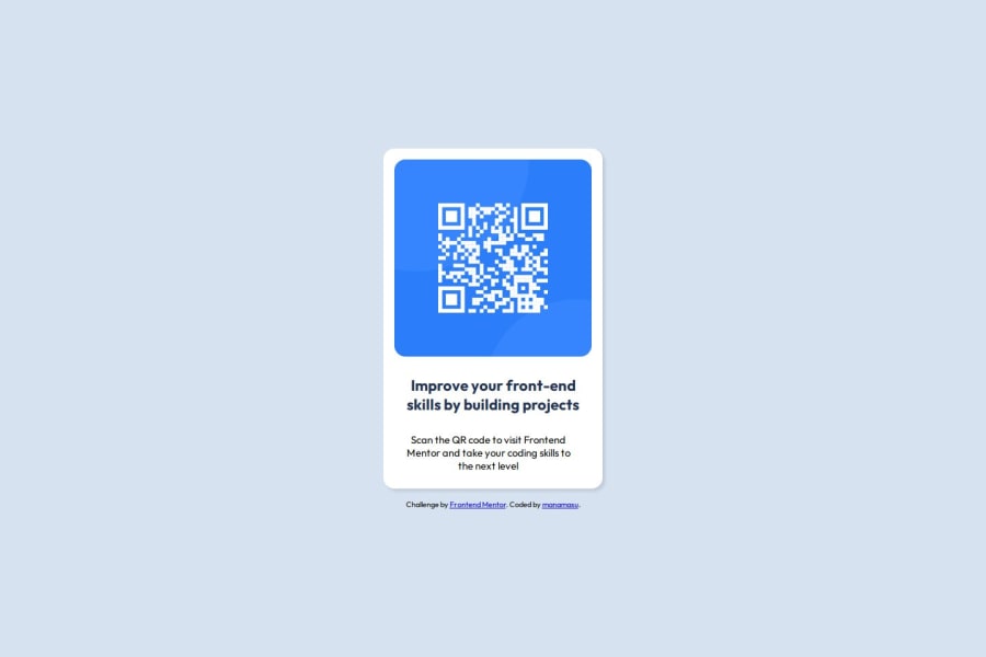
Desktop design screenshot for the QR code component coding challenge

This is a solution for...

  • HTML
  • CSS
1newbie
View challenge

Design comparison


SolutionDesign

Solution retrospective


What are you most proud of, and what would you do differently next time?

I take great pride in my ability to navigate CSS properties with minimal reliance on external resources as I had previous experience. In future projects, I aim to explore a broader range of properties and sizes to enhance the effectiveness of my designs as there always is room for improvement.

What challenges did you encounter, and how did you overcome them?

One challenge I faced was determining whether to create two separate containers within the card layout to maintain a small gap. Ultimately, I opted for a margin-bottom approach. This decision was based on the observation that using a fixed size did not compromise the integrity of our component across various screen sizes that I tested.

What specific areas of your project would you like help with?

Overall I am seeking guidance on optimizing my current approach and would appreciate insights into alternative options and possibilities that may have been overlooked during the implementation process.

Community feedback

P
Steven Stroud 4,140

@Stroudy

Posted

Amazing job with this! You’re making fantastic progress. Here are some small tweaks that might take your solution to the next level…

  • This does not matter that much at this stage but something to be mindful of for SEO(Search Engine Optimisation), <meta> description tag missing.

  • Using a <main> tag inside the <body> of your HTML is a best practice because it clearly identifies the main content of your page. This helps with accessibility and improves how search engines understand your content.

  • Setting the width and height for an <img> helps the page load faster and prevents content from jumping around as the image loads. This is good for performance and improves user experience. However, if your image needs to keep a consistent shape (aspect ratio) across different screen sizes, it's better to use the CSS aspect-ratio property instead.

  • Having a clear and descriptive alt text for images is important because it helps people who use screen readers understand the content, making your site more accessible. It also improves SEO, as search engines use alt text to understand the image's context, helping your site rank better, Check this out Write helpful Alt Text to describe images,

  • Using a full modern CSS reset is beneficial because it removes default browser styling, creating a consistent starting point for your design across all browsers. It helps avoid unexpected layout issues and makes your styles more predictable, ensuring a uniform appearance on different devices and platforms, check out this site for a Full modern reset

  • Using a naming convention like BEM (Block, Element, Modifier) is beneficial because it makes your CSS more organized, readable, and easier to maintain. BEM helps you clearly understand the purpose of each class, avoid naming conflicts, and create reusable components, leading to a more scalable codebase. For more details BEM,

I hope you found this advice helpful! Keep up the great work, and don’t forget to dive deeper into the details. You’re doing amazing, and I can’t wait to see what you create next. Happy coding! 🚀

Marked as helpful

1

manamasu 10

@manamasu

Posted

@Stroudy Thank you for your positive feedback! I appreciate your suggestions for enhancing the solution, particularly regarding SEO best practices such as adding a description tag and using a tag for improved accessibility. Additionally, I will consider implementing the CSS aspect-ratio property for images and adopting a modern CSS reset along with the BEM naming convention to ensure better organization and consistency across browsers. Generally I wasn't aware of most of the things mentioned and try to follow and improve on best practices as much as I can!

0

@SvitlanaSuslenkova

Posted

<div class="text-container"> should become <main>, <h3> is better to change to <h1> as in your project you don't have <h1> yet. Hope you found this comment helpful :)
1

manamasu 10

@manamasu

Posted

@SvitlanaSuslenkova Thanks for the great suggestions! Changing <div class="text-container"> to <main> and updating <h3> to <h1> will probably enhance the structure of the project. I appreciate your input and hope you continue to share your insights! :)

0

Please log in to post a comment

Log in with GitHub
Discord logo

Join our Discord community

Join thousands of Frontend Mentor community members taking the challenges, sharing resources, helping each other, and chatting about all things front-end!

Join our Discord