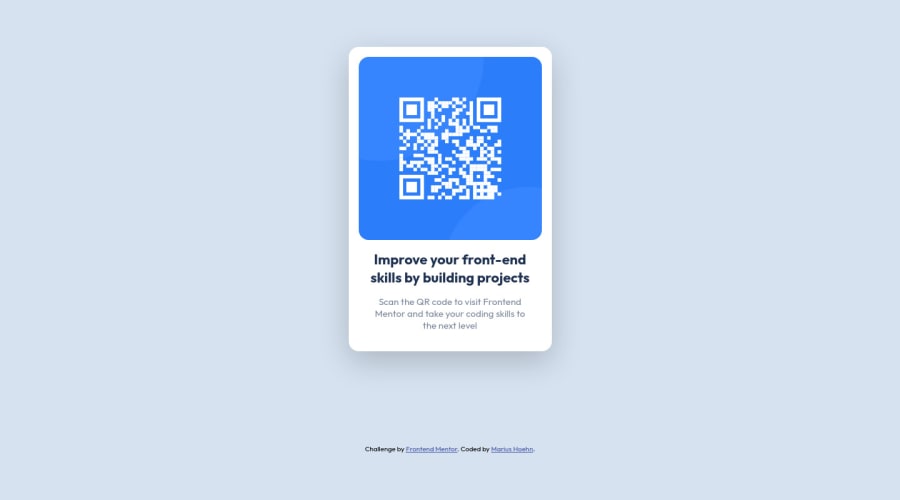
Design comparison
Community feedback
- @correlucasPosted about 2 years ago
👾Hello again Marius, congrats on completing this challenge!
Here’s some tips to improve your solution code:
Something I've noticed in your code is that in many occasions you've added some
<div>to wrap contents that don't really need to be inside of a div block. Note that for this challenge all you need is a single block to hold all the content, can be<div>or<main>if you want to use a semantic tag to wrap the content, the cleanest structure for this challenge is made by a block of content with div/main and all the content inside of it (img, h1 and p) without need of any other div or something. See the structure below:<body> <main> <img src="./images/image-qr-code.png" alt="Qr Code Image" > <h1>Improve your front-end skills by building projects</h1> <p>Scan the QR code to visit Frontend Mentor and take your coding skills to the next level</p> </main> </body>✌️ I hope this helps you and happy coding!
Marked as helpful0@ir4MPosted about 2 years ago@correlucas I see what you mean and have changed it. Thank you.
At least for the card body div (h1 and p) I thought wrapping them into a div makes sense because both elements have more padding on the left and right side than the image. And so I only have to write the padding once for the card body div. Instead of writing it for h1 and p.
But I guess it's better to have the cleanest possible html structure.
0
Please log in to post a comment
Log in with GitHubJoin our Discord community
Join thousands of Frontend Mentor community members taking the challenges, sharing resources, helping each other, and chatting about all things front-end!
Join our Discord
