Not Found
Not Found
Not Found
Not Found
Not Found
Not Found
Not Found
Not Found
Not Found
Not Found
Not Found
Not Found
Not Found
Not Found
Not Found
Request failed with status code 502
Not Found
Not Found
Not Found
Not Found

Submitted

QR code card component

karanpr01 10

@karanpr01

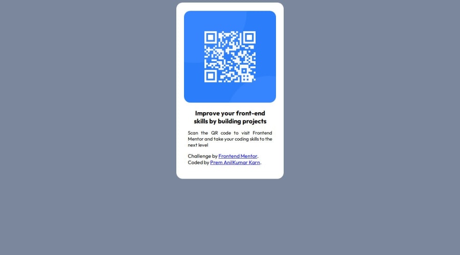
Desktop design screenshot for the QR code component coding challenge

This is a solution for...

  • HTML
  • CSS
1newbie
View challenge

Design comparison


SolutionDesign

Solution retrospective


What are you most proud of, and what would you do differently next time?

I am proud of that i am doing some actual project to improve my forntend skill and I will keep doing it.

What challenges did you encounter, and how did you overcome them?

I was not able to get confident on my learning but I am feeling little confident in showcasing my skill.

What specific areas of your project would you like help with?

Need help in understanding design and color templates of the files.

Community feedback

geomydas 1,060

@geomydas

Posted

Tips

  1. For a single container or a small project (qr code, 3 row grid, grid price, etc. on frontendmentor) if you want to center something perfectly without experimenting with paddings and margins, what I'd reccomend is this;

.parent-element (preferably the body element) {display: flex; align-items: center; justify-content: center; width: 100vw; height: 100vh}

I'll explain the code snippet. display: flex - allows you to use the flex properties in css (align-items, justify-content, etc.)

align-items: center - centers the nested elements in the secondary axis (which is vertical by default but you change that with flex-direction)

justify-content: center - same as earlier, but horizontally

I set the width and height in viewport (vw and vh) units for the centering to be responsive and the 2 properties Iier needs a defined width and height to work.

  1. For understanding the design and color templates of the file. (You mean styleguide.md and the .figma file right?)
  • Learn how to use figma for developers (https://www.frontendmentor.io/articles/figma-for-developers-how-to-work-with-a-design-file-m6CZKZ1rC1)

-Try out different colors that said in the styleguide.md and check if it is the same as the design. Same as font, some checking in here and there.

  1. Use Prettier extension in Visual Studio Code for better readability

Critique

  1. Appropriate tags should be used in your HTML

" <p class="title">Improve your front-end skills by building projects</p> " This should be an <h1> tag since it is the heading and main attention.

  1. CSS: After finishing it, reedit your code if possible and remove extra errors

For example, I saw 2 align-items: center on your .container selector. That does absolutely nothing and you should remove the other.

Marked as helpful

1
karanpr01 10

@karanpr01

Posted

Thank you for your guidance I will definitely do correction and remember it for the next time. Once again thank you mr/miss geomydas

0

Please log in to post a comment

Log in with GitHub
Discord logo

Join our Discord community

Join thousands of Frontend Mentor community members taking the challenges, sharing resources, helping each other, and chatting about all things front-end!

Join our Discord