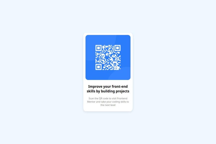
Design comparison
SolutionDesign
Solution retrospective
What are you most proud of, and what would you do differently next time?
I am proud of starting to actually putting my skills into practice , and finally achieving the goal while learning about my strengths and areas i lack practice in, perhaps next time i should deepen my knowledge regarding the css flex box as it seems a very important concept in css.
What challenges did you encounter, and how did you overcome them?this project was a bit simple actually , how ever i had to learn more about git and github which turned out pretty useful and simple once you understand them.
What specific areas of your project would you like help with?for the meantime , none.
Community feedback
Please log in to post a comment
Log in with GitHubJoin our Discord community
Join thousands of Frontend Mentor community members taking the challenges, sharing resources, helping each other, and chatting about all things front-end!
Join our Discord
